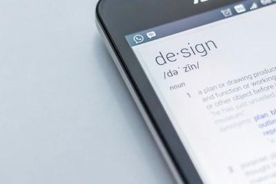
Learn more about product with this collection
How to align stakeholders
Best practices in product management leadership
How to create value together
One view to rule them all
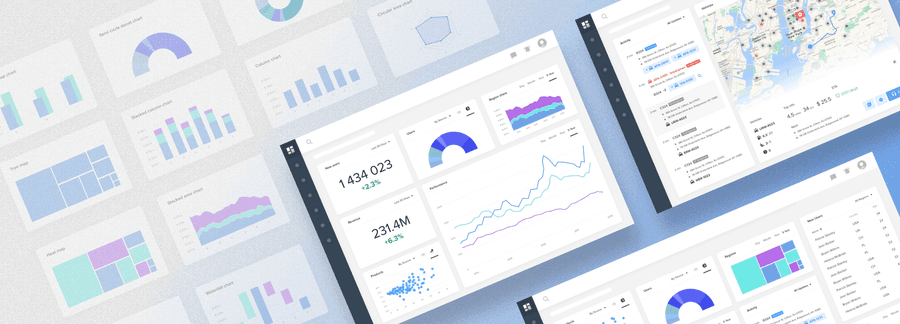
A dashboard is an at-glance preview of the most crucial information for the user at the moment he is looking at it, and an easy way to navigate directly to various areas of the application that require the user's attention.
The term “dashboard” is a metaphor for a car dashboard, sometimes also called the cockpit area, usually near the front of an aircraft or spacecraft, from which a pilot controls the aircraft.
2
4 reads
Define the purpose of the dashboard
The dashboard has a specific purpose that it’s undertaken to serve. Getting this wrong renders your further efforts meaningless.
- Operational dashboards: The main goals of it are to present data deviations to the user quickly and clearly, show current resources, and display their status. It’s a digital control room designed to help users be quick, proactive, and efficient.
- Analytical dashboard: A primary goal of this kind of dashboard is to help users make the best sense of the data, analyze trends and drive decision making.
2
4 reads
Chose the right representation for the data.
Choosing the wrong chart type, or defaulting to the most common type of data visualization could confuse users or lead to data misinterpretation.
To help you choose the right representation type for the chart, ask yourself these questions:
- How many variables do you want to show in a single chart?
- Will you display values over a period of time, or among items or groups?
- How many data points are needed to display for each variable?
2
0 reads
Follow clear and consistent naming conventions and consistent date formatting, and truncate large values
As the main goal of the dashboard is to get the message across at a glance, every little thing counts.
The biggest benefit of using a clear framework is data consistency. If your data is named the same way in each tool, it will be easier for you to use those tools. One framework. No questions.
2
1 read
Define the layout and flow. Prioritize
Grids can help you to achieve effective alignment and consistency with little effort and create a basic structure or a skeleton for your design. They consist of “invisible” lines upon which your design elements can be placed.
Doing so ties them together in an overall “system” and supports your composition rationally. That’s is crucial for dashboard design as you will need to organize a ton of information in a seamless way.
2
0 reads
Use building blocks with a consistent structure
Cards are easy to arrange. The most important thing about cards is that they are almost infinitely manipulatable. They are a good choice for responsive design since cards act as content containers that easily scale up or down.
An important characteristic of cards is the consistent layout of controls and data inside. Put the name in the top left corner, align view controls or actions to in the top right corner of the card, and leave the rest for the content. When all have a consistent structure, it’s easier for the users to work with the interface — they find everything where they expect it.
2
1 read
Double your margins
White space, also known as negative space, is the area between elements in a design composition. Readers aren’t usually aware of the importance of the negative space, but designers pay a lot of attention to it.
If the white space is not balanced, a copy will be hard to read. That’s why negative space matters as much as any other typography element.
2
0 reads
Don’t hide information or rely on interactions too much
Designing long scrollable dashboards is one of the most frequent mistakes designers make. They try to display more information in a clear way, positioning it one under another in order to avoid overwhelming the user.
As a result, only the information visible above the screen fold is likely to be discovered by users. Everything below gets little attention from users.
The solution is prioritization.
2
1 read
Personalization rather than customization
Personalization and customization are techniques that can help you ensure that users see what matters to them.
- Personalization is done by the system itself. The system should be set to identify users and deliver to them the content, experience, or functionality that matches their role.
- Customization is done by the user. A system may enable users to customize or make changes to the experience to meet their specific needs by configuring the layout, content, or system functionality.
2
0 reads
When integrating data tables or lists, make sure they are interactive and data is aligned correctly
A data table is a great solution when you need to show a lot of information for a large number of items.
There are many other benefits — it’s a great use of space, offers easy scalability, easier development, and users are typically comfortable working with grids as many people are already comfortable working with Microsoft Excel.
2
0 reads
Design the dashboard last
A dashboard is a summary view of everything else and displays key info from various parts of the application. It’s just more practical to design it at the end.
Otherwise, you will need to constantly go back and update your dashboard designs while you are working on all the other pages. Furthermore, once a majority of the views are designed, you will have a ton of components to work with when putting together a dashboard.
2
5 reads
CURATED BY

More like this
5 ideas
What is Emotional Design? | Interaction Design Foundation (IxDF)
interaction-design.org

2 ideas
Design better data tables
medium.com
9 ideas
Plain vs simple in product design
uxdesign.cc
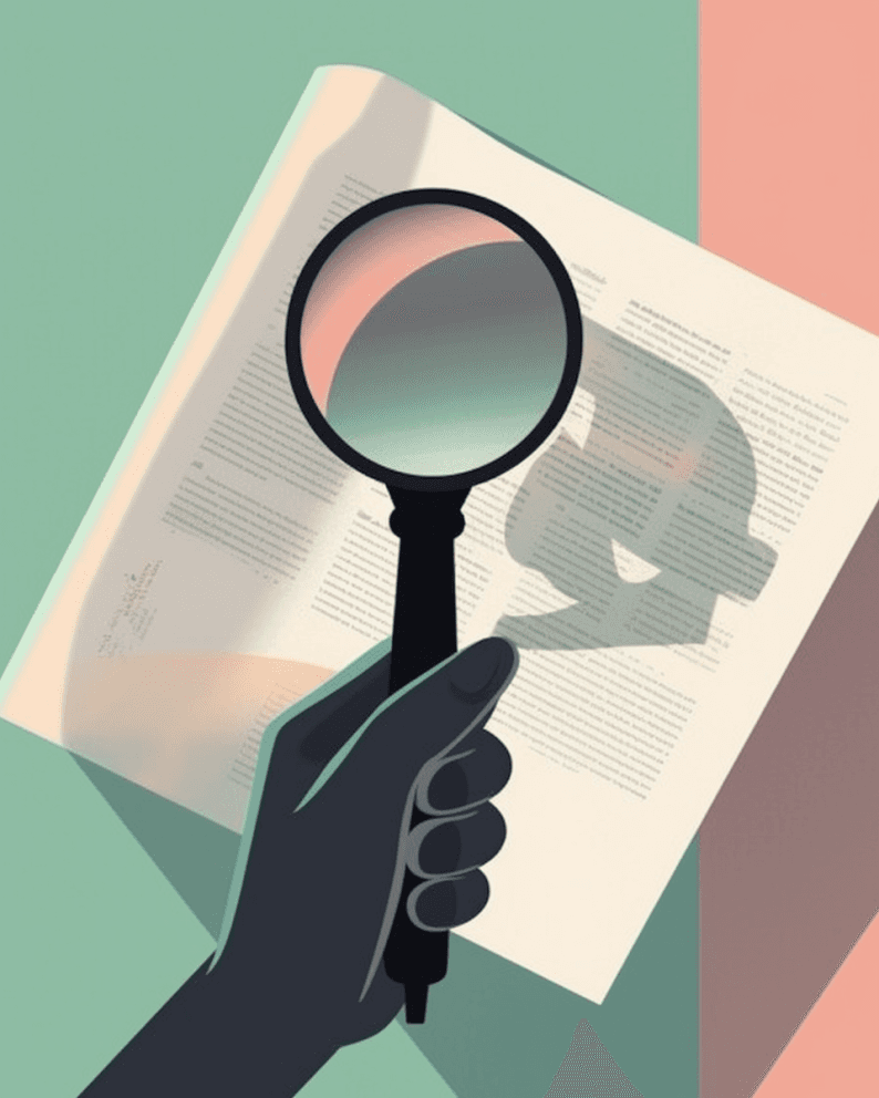
Read & Learn
20x Faster
without
deepstash
with
deepstash
with
deepstash
Access to 200,000+ ideas
—
Access to the mobile app
—
Unlimited idea saving & library
—
—
Unlimited history
—
—
Unlimited listening to ideas
—
—
Downloading & offline access
—
—
Personalized recommendations
—
—
Supercharge your mind with one idea per day
Enter your email and spend 1 minute every day to learn something new.
I agree to receive email updates