Learn more about product with this collection
How to analyze churn data and make data-driven decisions
The importance of customer feedback
How to improve customer experience
Designing for user understanding
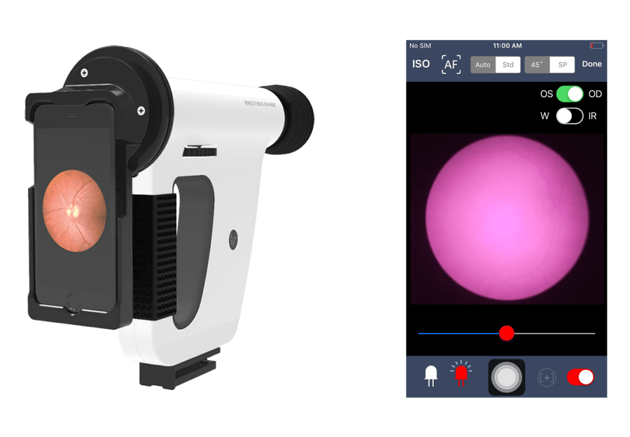
The issue: Users incorrectly used a new medical device that capture images of the human retina. Users didn't read the user manuals or watch the training videos. This could potentially cause a false diagnosis and possibly permanent blindness.
The team had to re-train the medical staff but couldn't sustainably do this for every customer. The only solution was to improve the UX. Ultimately, the issue was lacking direction in designing for user understanding.
Three biggest takeaways:
- Be bold
- Exploit familiar analogies
- Think beyond screens and wireframes.
8
161 reads
Preventing key issues
The product suffered from two key issues:
- Essential complexity: Essential complexity is directly caused by the problem you're trying to solve. It suggests removing less important functionalities.
- The 80/20 rule - users only use 20% of your product 80% of the time. Anything beyond the 20% is adding to UX confusion.
Solving the UX required dropping anything non-essential and simplifying the essential.
7
78 reads
Be bold
The complexity of a product and having a lot at stake can make it difficult to take risks. This makes it easier to fall prey to the 'focusing illusion."
The focusing illusion is a bias that states that nothing in life is as important as you think while thinking about it. It can prevent you from being bold.
The first step is to force yourself to err on the other extreme.
6
71 reads
Exploit familiar analogies, progressive disclosure
Replace, not remove.
Essential complexity can be simplified with familiar analogies.
- This can reduce the amount of learning for the user.
- It eliminates any potential confusion a user may have.
Progressive disclosure.
This is the practice of only showing features that are immediately relevant to the user. Everything else is hidden from view. This is great for essential features that are rarely used.
6
65 reads
Think beyond screens and wireframes
While working on a re-design, it's easy to become too focused on the UI.
However, broadening your perspective and designing beyond screens or wireframes can solve a user's problem.
6
49 reads
CURATED BY
CURATOR'S NOTE
This company built medical devices that captured images of the human retina. But the UX was complex, potentially causing errors. Using an iPhone helped them to tap into their network of accomplished app designers and ask for help. Apple noticed the device, and reached out and offered to help. This experience resulted in three key UX take-aways.
“
More like this
6 ideas
Chat GPT | How To Speak With Girls
chat.openai.com
2 ideas
PostgreSQL - How to Configure Slow Query Log
postgresql.org
Read & Learn
20x Faster
without
deepstash
with
deepstash
with
deepstash
Access to 200,000+ ideas
—
Access to the mobile app
—
Unlimited idea saving & library
—
—
Unlimited history
—
—
Unlimited listening to ideas
—
—
Downloading & offline access
—
—
Personalized recommendations
—
—
Supercharge your mind with one idea per day
Enter your email and spend 1 minute every day to learn something new.
I agree to receive email updates


