

Learn more about product with this collection
How to align stakeholders
Best practices in product management leadership
How to create value together
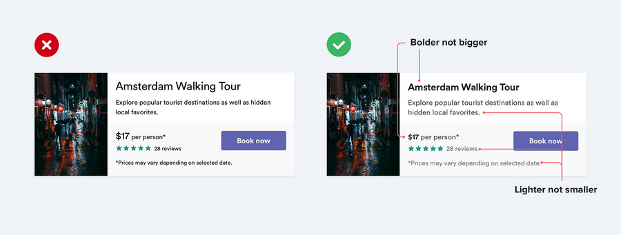
Use color and weight to create hierarchy instead of size
A common mistake when styling UI text is relying too much on font size to control your hierarchy.
Try and stick to two or three colors:
- A dark color for primary content
- A grey for secondary content
- A lighter grey for ancillary content
66
524 reads
Don’t use grey text on colored backgrounds
Making text a lighter grey is a great way to de-emphasize it on white backgrounds, but it doesn’t look so great on colored backgrounds.
That’s because the effect we’re actually seeing with grey on white is reduced contrast.
Making the text closer to the background color is what actually helps create hierarchy, not making it light grey.
55
231 reads
Offset your shadows
Instead of using large blur and spread values to make box shadows more noticeable, add a vertical offset.
It looks a lot more natural because it simulates a light source shining down from above like we’re used to seeing in the real world.
53
209 reads
Use fewer borders
When you need to create separation between two elements, try to resist immediately reaching for a border.
54
233 reads
Don’t blow up icons that are meant to be small
While it’s true that vector images won’t degrade in quality when you increase their size, icons that were drawn at 16–24px are never going to look very professional when you blow them up to 3x or 4x their intended size. They lack detail, and always feel disproportionately “chunky”.
54
165 reads
Use accent borders to add color to a bland design
If you’re not a graphic designer, how do you add that dash of visual flair to your UI that other designs get from beautiful photography or colorful illustrations?
One simple trick that can make a big difference is to add colorful accent borders to parts of your interface that would otherwise feel a bit bland.
55
150 reads
Every action on a page sits somewhere in a pyramid of importance
When designing these actions, it’s important to communicate their place in the hierarchy.
- Primary actions should be obvious. Solid, high contrast background colors work great here.
- Secondary actions should be clear but not prominent. Outline styles or lower contrast background colors are great options.
- Tertiary actions should be discoverable but unobtrusive. Styling these actions like links is usually the best approach.
56
146 reads
CURATED BY


More like this


Read & Learn
20x Faster
without
deepstash
with
deepstash
with
deepstash
Access to 200,000+ ideas
—
Access to the mobile app
—
Unlimited idea saving & library
—
—
Unlimited history
—
—
Unlimited listening to ideas
—
—
Downloading & offline access
—
—
Personalized recommendations
—
—
Supercharge your mind with one idea per day
Enter your email and spend 1 minute every day to learn something new.
I agree to receive email updates