

Learn more about artsandculture with this collection
How to analyze churn data and make data-driven decisions
The importance of customer feedback
How to improve customer experience
A Color Exercise for our Brand’s Illustration
To streamline our illustration process we decided to conduct an exercise, an experiment of sorts, in color harmonies with our recently updated color palette.
We wanted to treat this exercise as a guideline that would help us use our brand’s unique set of colors effectively and efficiently. With an array of hues, shades, and tints to choose from, we knew this exercise would be a time-saver when working with color.
5
7 reads
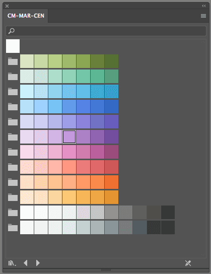
Creative Market’s Color Palette
Our color palette includes a wide range of tones and we aim to utilize the entire spectrum of colors to create warmth and energetic work. Our team already uses a shared swatch library which allows for easy access and color consistency for the entire team. Below is a screenshot of Creative Market’s colors:
5
3 reads
Color Combinations
A systematic approach would work best and decided to study color combinations that are regarded as harmonies. These combinations are known to have pleasing or contrasting quality to them and consists of these groups: analogous, complementary, Split-Complementary& Side-complementary, and Triad. There are numerous other color groups but we chose these harmonies that were unique for our use.
5
2 reads
A Few Color Techniques
Along with the color guide we also researched color techniques in Illustrator that would improve our workflow.
5
2 reads
Quick tip #1 — Global Colors
We’ve recently begun to use this magnificent trick in Illustrator. There are various examples and tutorials online on how to use global colors, but in short they are a great way to change colors quickly when working with multiple shapes and layers in an illustration. Here’s an example:
5
1 read
Quick Tip #2 — Recolor Artwork
Creative market uses a tool called Recolor artwork to change the hue of our brand's color wheel in real time. The goal is to have a guide that provides a refresher and speeds up our decision making process when it comes to color Pairings. The colors we choose and the combinations we make are important factors for our brand personality. And it doesn’t stop here, we’re continually searching and improving our process.
5
1 read
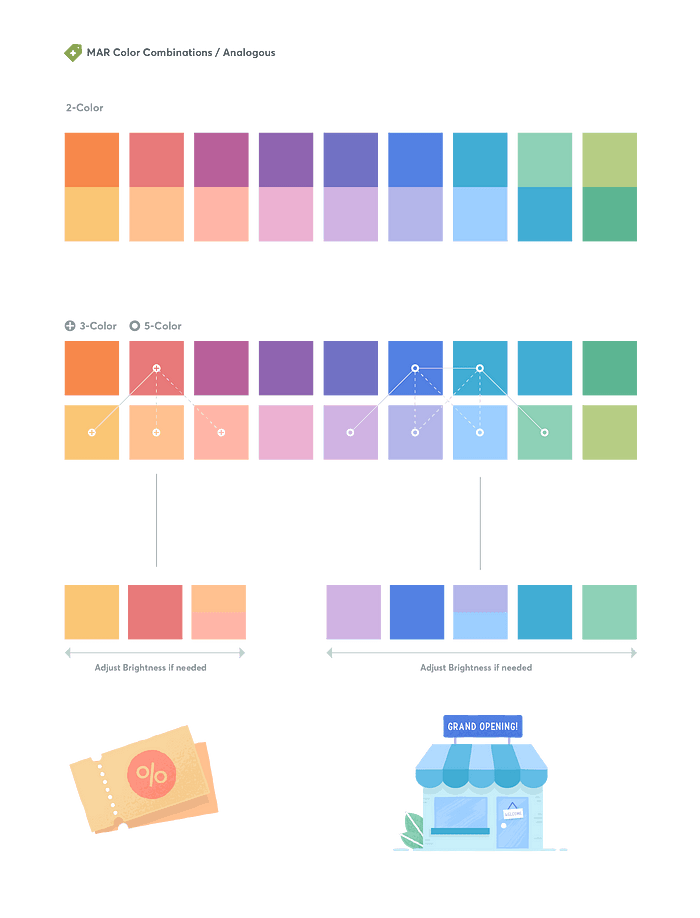
Analogous
A group of three colors that are next to each other on the color wheel.
We tend to use these when working with smaller spot illustrations. This combination is very reliable and aesthetically pleasing but when using this harmony we need to ensure that focus & visual interest is created using chromatic contrast.
5
2 reads
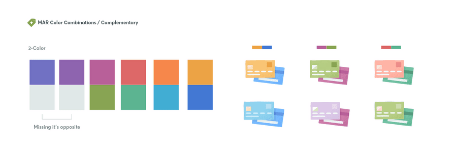
Complementary
Colors directly opposite each other in the color wheel.
We do not tend to use this combination due to the visual tension it creates. Most of our projects do not require this level of contrast which may distract from our project goal when working with our product or marketing team.
5
1 read
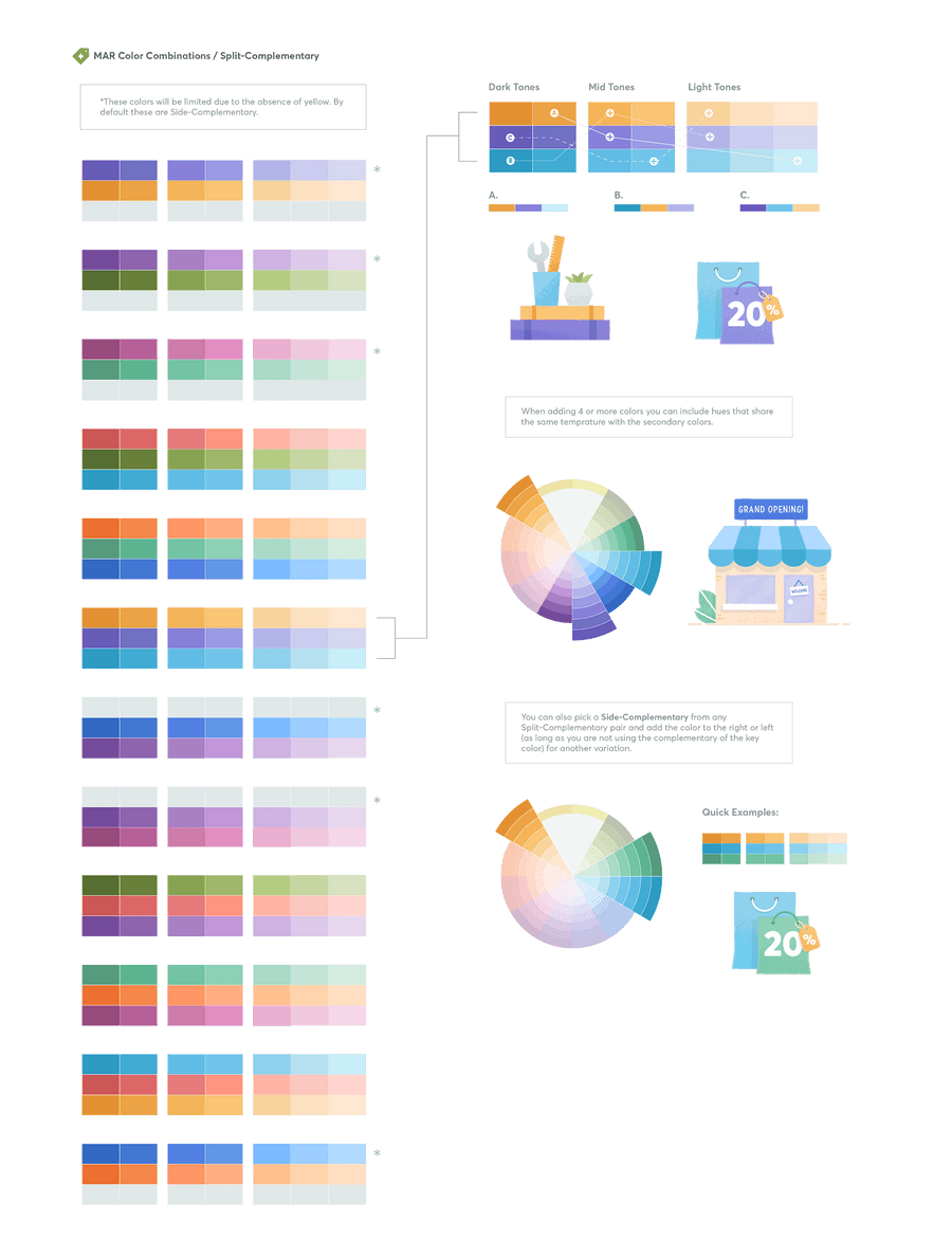
Split-Complementary & Side-Complementary
This is a variation of the complementary color scheme. It uses the base color plus two “Analogous” colors (or just one if it’s a Side-Complementary) adjacent to its complement.
We use this color relationship the most in our illustrations. As mentioned earlier, we want to use the entire spectrum of color to convey dynamic work. This harmony gives enough contrast to create visual interest without the intensity that can occur in complementary harmonies.
5
2 reads
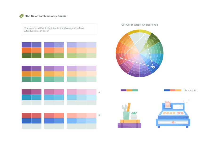
Triad
Colors that are evenly spaced around the color wheel
We tend to use this harmony for larger illustration work where we want to use the entire spectrum of color as a representation of our creative community and company. When using so many colors we’re mindful of how and where we place colors together in our illustration. This ensures that the visual mood stays within our company’s voice & tone.
5
1 read
CURATED BY


More like this


Read & Learn
20x Faster
without
deepstash
with
deepstash
with
deepstash
Access to 200,000+ ideas
—
Access to the mobile app
—
Unlimited idea saving & library
—
—
Unlimited history
—
—
Unlimited listening to ideas
—
—
Downloading & offline access
—
—
Personalized recommendations
—
—
Supercharge your mind with one idea per day
Enter your email and spend 1 minute every day to learn something new.
I agree to receive email updates