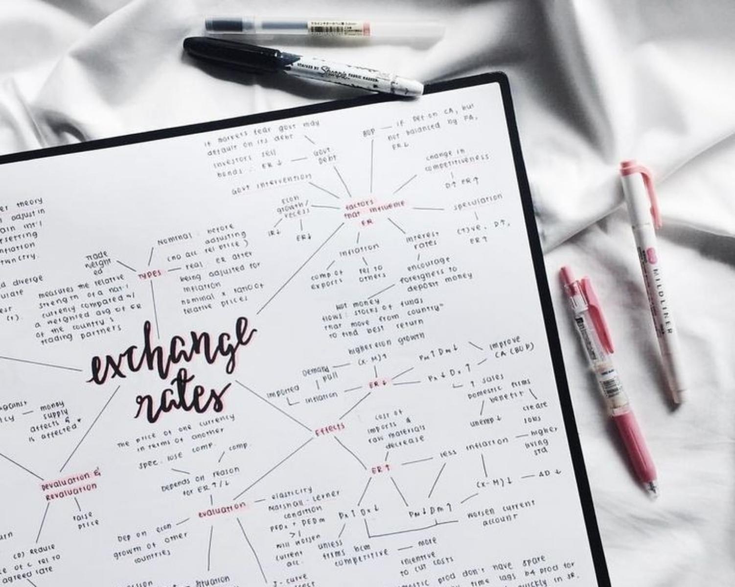
How to make a mind map
Tony Buzan’s recommendations include: using a landscape format; starting with a central image to represent your topic or theme; using curving lines to add main branches to the center and then connecting these to smaller branches; using single words and images; and adding colors for aesthetic and organizational purposes.
27
296 reads
CURATED FROM
IDEAS CURATED BY
For a better learning...
“
Read & Learn
20x Faster
without
deepstash
with
deepstash
with
deepstash
Personalized microlearning
—
100+ Learning Journeys
—
Access to 200,000+ ideas
—
Access to the mobile app
—
Unlimited idea saving
—
—
Unlimited history
—
—
Unlimited listening to ideas
—
—
Downloading & offline access
—
—
Supercharge your mind with one idea per day
Enter your email and spend 1 minute every day to learn something new.
I agree to receive email updates
