The key to fixing bad design is to find the “root cause” of the problem.
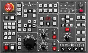
In the old flight control model, the button to increase or decrease velocity looked the same as the button to increase or decrease the angle of descent or ascent. This led to many pilots getting confused; although it was the pilots who were making the mistakes by confusing the buttons, it was the design error of making the buttons confusing (the root cause) that led to the mistakes in the first place.
By changing the flight controls’ appearance, designers were, paradoxically, able to decrease the chances of “human error.”
76
696 reads
CURATED FROM
IDEAS CURATED BY
Good design uses human psychology to create products adapted to users’ needs and desires. Human-centered design focuses on creating products for the users, and helps users learn how to use a product, avoid dangerous errors and bring users and technology closer together.
“
Read & Learn
20x Faster
without
deepstash
with
deepstash
with
deepstash
Personalized microlearning
—
100+ Learning Journeys
—
Access to 200,000+ ideas
—
Access to the mobile app
—
Unlimited idea saving
—
—
Unlimited history
—
—
Unlimited listening to ideas
—
—
Downloading & offline access
—
—
Supercharge your mind with one idea per day
Enter your email and spend 1 minute every day to learn something new.
I agree to receive email updates
