Explore the World's Best Ideas
Join today and uncover 100+ curated journeys from 50+ topics. Unlock access to our mobile app with extensive features.
Design better forms
Whether it is a signup flow, a multi-view stepper, or a monotonous data entry interface, forms are one of the most important components of digital product design.
11
296 reads
Design better forms: best practices
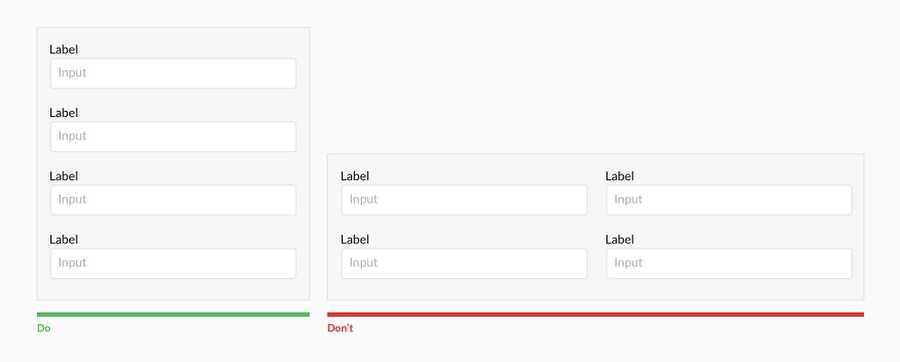
- Forms should be one column Multiple columns disrupt a user's vertical momentum
- Top align labels
- Group labels with their inputs
- Place checkboxes (and radios) underneath each other for scannability
- Make CTAs descriptive
- Specify errors inline
- Differentiate primary from secondary actions
- Ditch the * and denote optional fields
- Group related information
15
153 reads
IDEAS CURATED BY
Jenny Whitney's ideas are part of this journey:
Learn more about product with this collection
How to focus on the present moment
How to cultivate empathy and understanding towards others
How to set personal and professional goals
Related collections
Similar ideas
4 ideas
How to Design Great UX for Sign Up Form
uxplanet.org
1 idea
Foreign Key on Models | Django documentation
docs.djangoproject.com
6 ideas
Why Life Can’t Be Simpler
fs.blog
Read & Learn
20x Faster
without
deepstash
with
deepstash
with
deepstash
Personalized microlearning
—
100+ Learning Journeys
—
Access to 200,000+ ideas
—
Access to the mobile app
—
Unlimited idea saving
—
—
Unlimited history
—
—
Unlimited listening to ideas
—
—
Downloading & offline access
—
—
Supercharge your mind with one idea per day
Enter your email and spend 1 minute every day to learn something new.
I agree to receive email updates

