2. Unexpected Illustrations
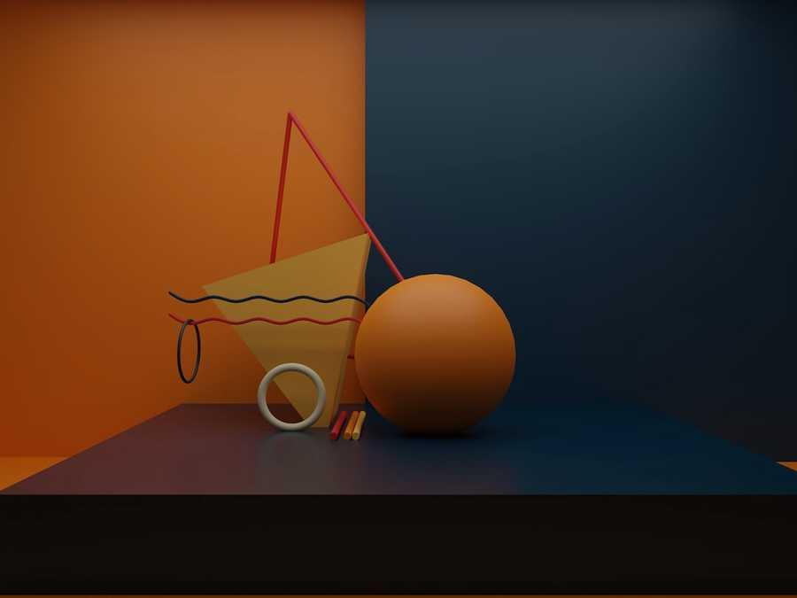
This might be the most fun we’ve seen with a website design trend in a while – projects and companies are using illustrations in some of the most unexpected places.
A simple illustration takes the design to another level, or illustrations mix with other elements to paint a whimsical overall scene. Those are the things you can find with each of these three examples.
Krivitzky is a website for a business law firm. This is not at all the type of website where you’d expect illustrations (including a dragon). While the design is fun to interact with, it’s hard to say if it works.
6
3 reads
CURATED FROM
IDEAS CURATED BY
🙋Am a self taught Digital Creator , Editor 💻 from India 🇮🇳 , as well as a Technologist and a COD Gamer 🎮. Interested in learning📒 new things always for keeping up with the trend .
The idea is part of this collection:
Learn more about product with this collection
Essential product management skills
How to work effectively with cross-functional teams
How to identify and prioritize customer needs
Related collections
Read & Learn
20x Faster
without
deepstash
with
deepstash
with
deepstash
Personalized microlearning
—
100+ Learning Journeys
—
Access to 200,000+ ideas
—
Access to the mobile app
—
Unlimited idea saving
—
—
Unlimited history
—
—
Unlimited listening to ideas
—
—
Downloading & offline access
—
—
Supercharge your mind with one idea per day
Enter your email and spend 1 minute every day to learn something new.
I agree to receive email updates
