Line Charts, Circles and Bars πŸ“ˆπŸ“Š - Deepstash
Ultimate Guide to Reducing Churn

Learn more about marketingandsales with this collection

How to analyze churn data and make data-driven decisions

The importance of customer feedback

How to improve customer experience

Ultimate Guide to Reducing Churn

Discover 62 similar ideas in

It takes just

9 mins to read

Line Charts, Circles and Bars πŸ“ˆπŸ“Š

Line Charts, Circles and Bars πŸ“ˆπŸ“Š

An experiment was done to find out whether these styles(bar charts, line charts, scatterplots, and plain text) differ in how "casual" they make the data appear to people.

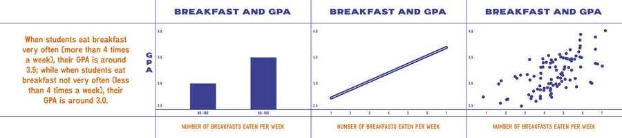
4 correlations were chosen to display visually. 4 different visualizations for each scenario.

Each participant saw 4 styles one representation of each scenario.

After they controlled for the relative plausibility of each scenario, the type of style didn’t observably impact ratings

For the causal statements: Participants rated information they saw in bar charts as the most causal and scatter plots as the least causal

4

13 reads

MORE IDEAS ON THIS

More Aggregation, More Assumptions of Causality

More Aggregation, More Assumptions of Causality

The same experiment was done, this time they developed bar charts, line charts, and scatterplots with three different levels of aggregation.

This time the type of chart had only a small effect on participants’ ratings of causality. Much more significant, however, was the effect of aggregati...

4

9 reads

Correlation isn't causation

According to new research from the Kellogg School, how data are visualized can significantly impact our interpretation of what we’re seeing sometimes for the worse. Our efforts to simplify charts by grouping data into smaller numbers of β€œbuckets” (say, two bars on a chart as opposed to ten) seeme...

3

21 reads

How to Visualize Responsibly

Be mindful when you aggregate, because the assumption people have may become a causal one. So think carefully about how you present your data and maybe iterate with your own design team or with your data analysts so people don’t misinterpret what you’re trying to say.

Even the most sophisti...

3

14 reads

Related collections

More like this

More Aggregation, More Assumptions of Causality

More Aggregation, More Assumptions of Causality

The same experiment was done, this time they developed bar charts, line charts, and scatterplots with three different levels of aggregation.

This time the type of chart had only a small effect on participants’ ratings of causality. Much more significant, however, was the effect of aggregati...

Read & Learn

20x Faster

without
deepstash

with
deepstash

with

deepstash

Access to 200,000+ ideas

β€”

Access to the mobile app

β€”

Unlimited idea saving & library

β€”

β€”

Unlimited history

β€”

β€”

Unlimited listening to ideas

β€”

β€”

Downloading & offline access

β€”

β€”

Personalized recommendations

β€”

β€”

Supercharge your mind with one idea per day

Enter your email and spend 1 minute every day to learn something new.

Email

I agree to receive email updates