Typography and Colors
After World War II, the intricate illustrations gave way to more abstract graphics that made use of typography and striking colors. In recent years, some companies have continued to update their brand identity.
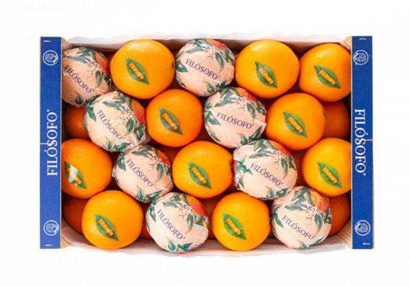
The 1960s brand Filosófo, for example, once sported a paper wrapper with concentric circles, illustrated stars, and a serif typeface. Today, it features a more contemporary typeface and a pristine, watercolor-like rendition of oranges adorned with blossoms; the stickers are shaped like leaves).
3
11 reads
The idea is part of this collection:
Learn more about marketingandsales with this collection
Essential product management skills
How to work effectively with cross-functional teams
How to identify and prioritize customer needs
Related collections
Read & Learn
20x Faster
without
deepstash
with
deepstash
with
deepstash
Personalized microlearning
—
100+ Learning Journeys
—
Access to 200,000+ ideas
—
Access to the mobile app
—
Unlimited idea saving
—
—
Unlimited history
—
—
Unlimited listening to ideas
—
—
Downloading & offline access
—
—
Supercharge your mind with one idea per day
Enter your email and spend 1 minute every day to learn something new.
I agree to receive email updates
