
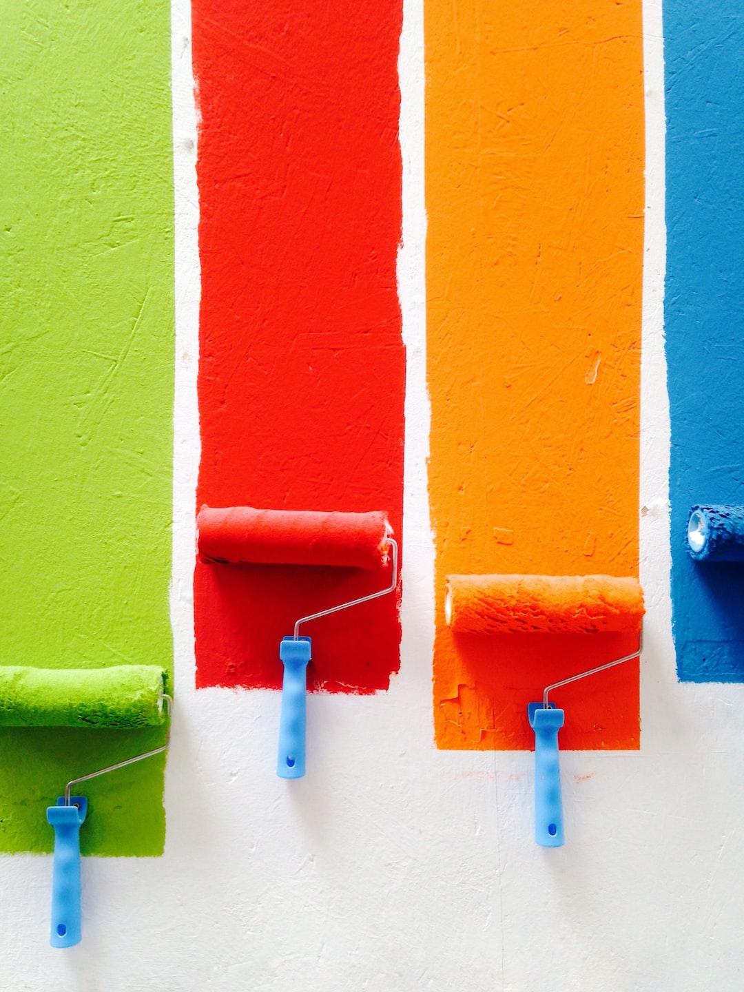
6. Use Color In Moderation
Too many colors can create a chaotic and confusing visual experience, while too few colors can create a monotone and boring design
42
548 reads
CURATED FROM
IDEAS CURATED BY

Choosing the right color for your design can be a critical factor in creating a successful and impactful visual experience. Here are some tips to help you choose the right color for your design...
“
Similar ideas to 6. Use Color In Moderation
Basic Graphic Design Principles
Repetition
- Definition: Repetition is simply repeating a single element many times in a design.
- Importance: To create a sense of unity and consistency throughout a design.
Contrast
- Definition: The difference between two or...
3. Recreating Stuff Over And Over Again
Copying and stealing web design is the best way to learn design, you can learn a ton of visual design concepts like typography, spacing and colors you will start learning patterns
Explore design sites and recreate the design and then find the patterns used to achieve that design

Minimalism Defined
Minimalism is defined as a design or style in which the simplest and fewest elements are used to create the maximum effect.
Minimalism had its origins in the arts—with the artwork featuring simple lines, only a few colors, and careful placement of those lines and colors.
Read & Learn
20x Faster
without
deepstash
with
deepstash
with
deepstash
Personalized microlearning
—
100+ Learning Journeys
—
Access to 200,000+ ideas
—
Access to the mobile app
—
Unlimited idea saving
—
—
Unlimited history
—
—
Unlimited listening to ideas
—
—
Downloading & offline access
—
—
Supercharge your mind with one idea per day
Enter your email and spend 1 minute every day to learn something new.
I agree to receive email updates