Explore the World's Best Ideas
Join today and uncover 100+ curated journeys from 50+ topics. Unlock access to our mobile app with extensive features.
Best practices and the future of confirmed action
The confirmation design pattern isn’t something to be taken lightly. If applied erroneously, or not at all, users may commit unintended havoc.
Confirmations ask a user to verify whether they want to proceed or cancel a requested action. Confirmations are used for destructive actions, like deleting a photo album, or consequential actions, like publishing this article.
4
47 reads
Dos and Don'ts
Confirmations are not always needed and can increase mistakes.
Good practice:
- Present the action as a question in the header
- Explain the outcome of the action in the body
- Restate the action in the confirmation button
Avoid:
- Ambiguous questions like “Are you sure?”
- Non-descriptive body copy
- Yes/No actions
- “Cancel” can cause confusion. When committing a destructive action, like discarding changes, users may mistake “cancel” for the intended action instead of cancelling the confirmation dialogue.
4
26 reads
The future of confirmed action
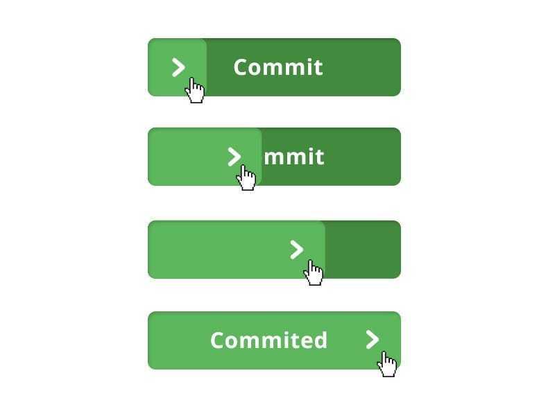
At first, a better button design was the response to the flat design trend. Buttons were less like buttons and could cause unintentionally harmful actions.
But with virtual reality, augmented reality, wearables, and gesture/voice-based interfaces of all kinds, we are moving to a future where the dexterity and context of an interaction is vastly different and will change the way we think about invoking action.
4
20 reads
IDEAS CURATED BY
Anthony Frederick's ideas are part of this journey:
Learn more about technologyandthefuture with this collection
The importance of networking in podcasting
How to grow your podcast audience
How to monetize your podcast
Related collections
Similar ideas
10 ideas
4 ideas
How to Design Great UX for Sign Up Form
uxplanet.org
7 ideas
7 Practical Tips for Cheating at Design
medium.com
Read & Learn
20x Faster
without
deepstash
with
deepstash
with
deepstash
Personalized microlearning
—
100+ Learning Journeys
—
Access to 200,000+ ideas
—
Access to the mobile app
—
Unlimited idea saving
—
—
Unlimited history
—
—
Unlimited listening to ideas
—
—
Downloading & offline access
—
—
Supercharge your mind with one idea per day
Enter your email and spend 1 minute every day to learn something new.
I agree to receive email updates


