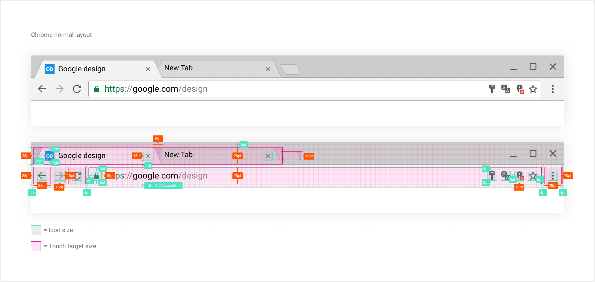
Touch targets and layout
In normal mode, we went for 28X28pt touch targets, holding 16X16pt icons. While icons kept their 28X28pt touch targets, we increased their surrounding margin to 8pt, giving the UI more space and reducing user touch errors.
We use 16X16pt iconography throughout. This minimizes the amount of design asset requiring maintenance, making long term scalability as well as feature iteration. Easier to maintain.
2
2 reads
CURATED FROM
IDEAS CURATED BY
The idea is part of this collection:
Learn more about product with this collection
Essential product management skills
How to work effectively with cross-functional teams
How to identify and prioritize customer needs
Related collections
Read & Learn
20x Faster
without
deepstash
with
deepstash
with
deepstash
Personalized microlearning
—
100+ Learning Journeys
—
Access to 200,000+ ideas
—
Access to the mobile app
—
Unlimited idea saving
—
—
Unlimited history
—
—
Unlimited listening to ideas
—
—
Downloading & offline access
—
—
Supercharge your mind with one idea per day
Enter your email and spend 1 minute every day to learn something new.
I agree to receive email updates
