Explore the World's Best Ideas
Join today and uncover 100+ curated journeys from 50+ topics. Unlock access to our mobile app with extensive features.
Timing and planning
At the beginning of 2013, Chrome was yet to become the default Browser on Android, it didn’t have a tablet version and has just been release on iOS.
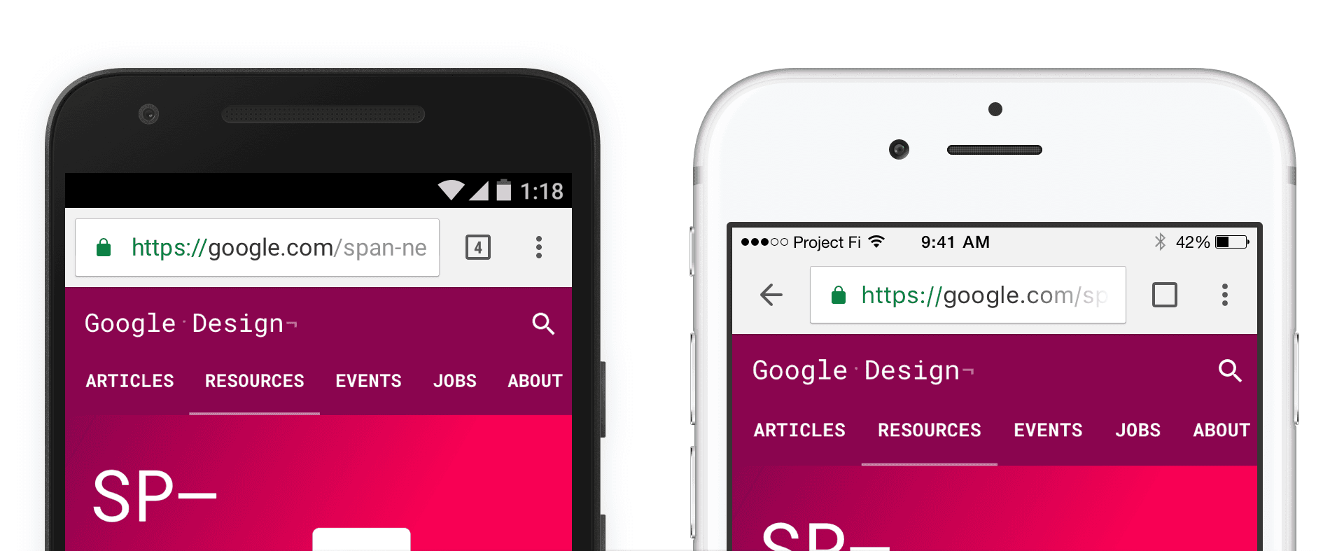
Mobile became the primary focus in the years separating the beginning of 2013 and the Chrome Android material design revamp of 2015.
We started seeing the desktop/laptop landscape shift into a state where touchscreen were no longer the exclusive attribute of mobile but also the one of more productive platforms such as laptops.
2
5 reads
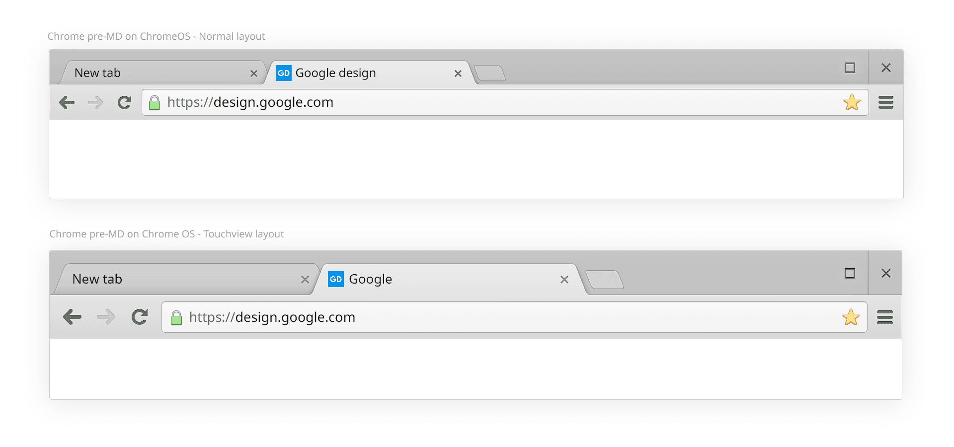
The Flat Design Era
As part of this big update cycle, Chrome received a revamp of its mobile properties, iOs and Android.
The desktop UI future was slowly taking shape and clearer opinions on the matter were forming. It is at that time, almost two years from now, that the chrome desktop redesign process started. It is at that time, almost two years from now, that the chrome desktop redesign process started.
2
1 read
The Hybrid layout type
From an engineering perspective Chrome is spread across 4 Frameworks/Codebases: views, cocoa on Macos, Java for Android, and Obj-C/Swift for iOS.
To keep our sanity and to enable better long term asset management, we try to share as much design resources as possible across platforms. For example Windows, Chrome OS and Mac share a lot of common visuals.
If you launch Chrome on an iPad or an Android tablet, they will look very similar.
2
2 reads
New layout type, new process
To do so, we needed two things:
- Regular mode was initially going to be deployed on the overwhelmingly largest portion of our user base.
- A way to create, export and implement our assets that would gracefully scale in the broad layout type and PPI landscape of desktop.
2
3 reads
Visual consistency and design details
- Bring the new tab shapes to life on desktop
- Bring a new set of icons, derived from MD using desktop sizes
- Align and simplify our color palette and our theming system. Bonus: Bring the new “dark” incognito to desktop
- Start the revamp of secondary UI elements such as buttons, toolbars, bubbles, etc…
- Create a more touchable version of Chrome for convertible devices
- Come up with a set of rules for Third party OS consistency
- Implement MD motion when possible
2
2 reads
General layout and UI footprint
The native frame on windows is taller than its Chrome OS and Mac OS counterparts.
It makes the frame easier to click and grab at the cost of a bigger footprint.
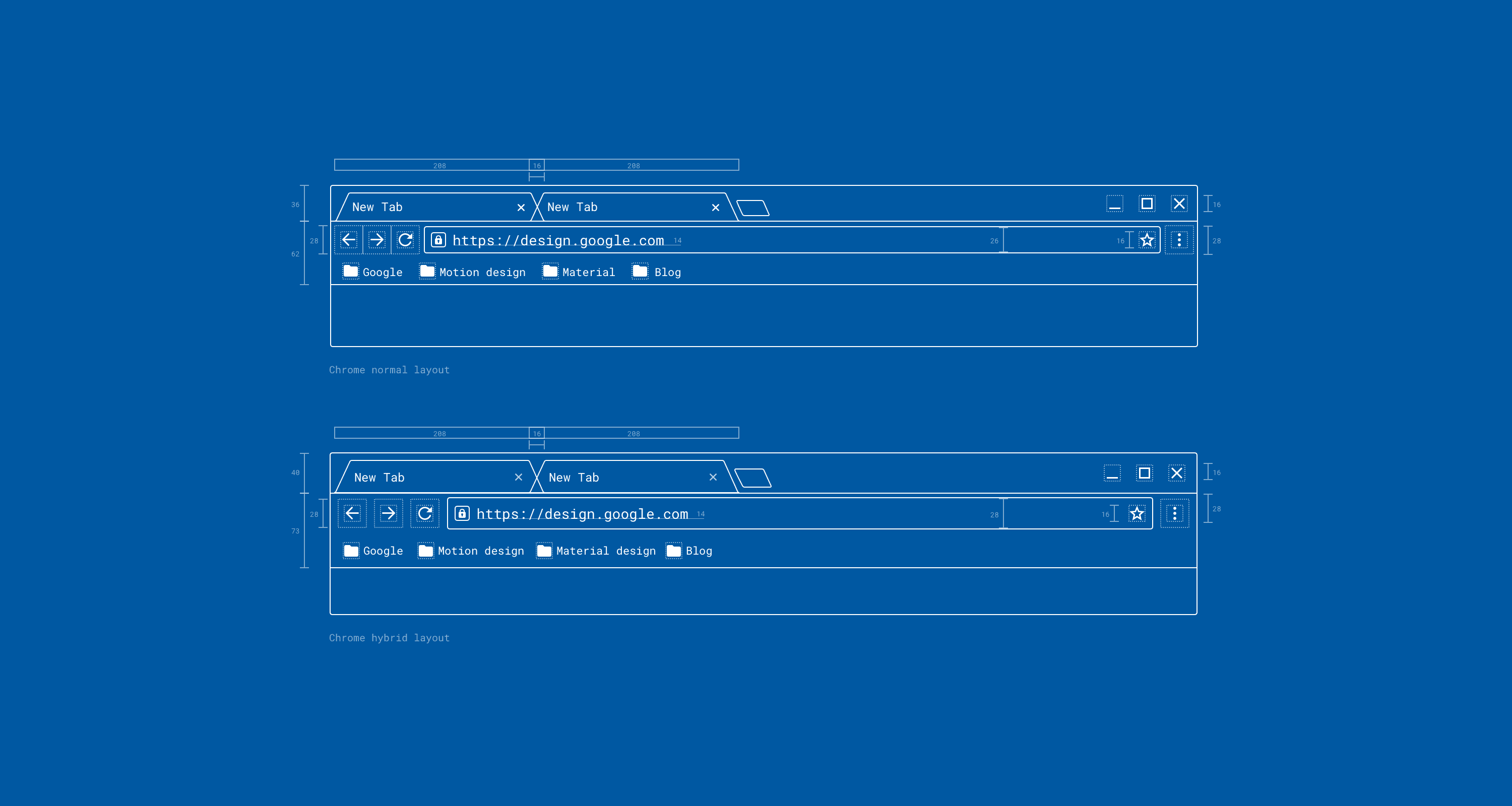
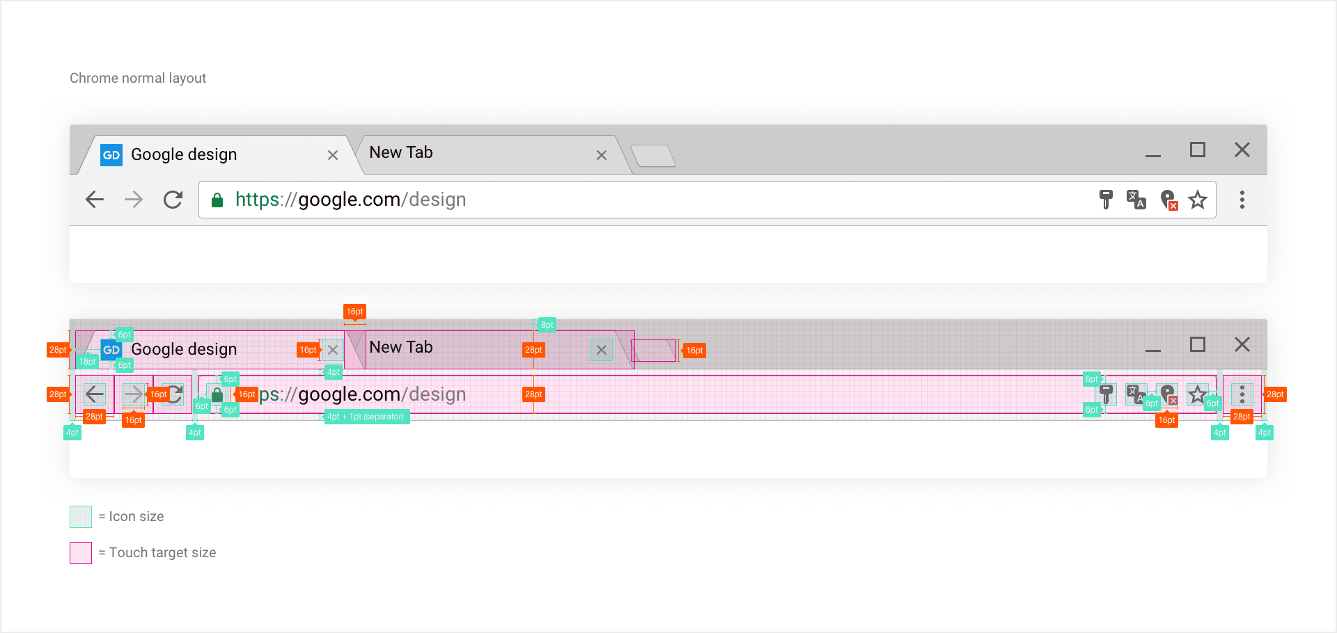
To achieve balance, we split the UI in half: tabs+ Window frame/ Toolbar. Tabs are 28pt, equal to the Omnibox height. We leave an 8pt top padding between the tabs and the top of the frame.
2
1 read
Iconography
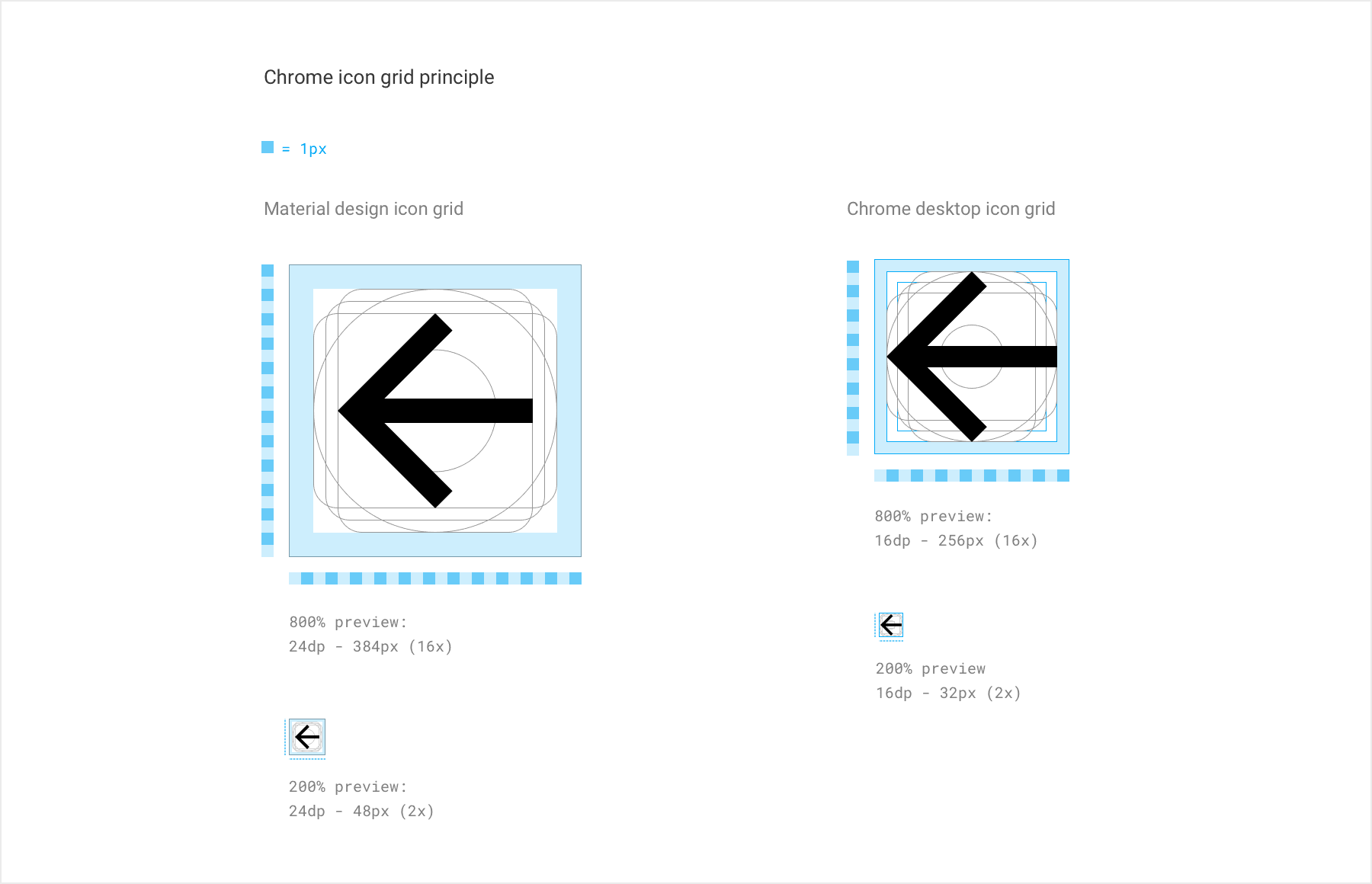
We used 16X16pt based icons to match our new normal and hybrid UI. We reduced the container from 24pt to 16pt and added some flexibility around the initial internal padding: 2pt change to 1pt to 2pt depending on the icon.
We also made the icon line weight slightly thinner (2Px on 100% and 3Px one 200% from the initial 2Px in 100% and 4Px in 200%) this way, they are more elegant and balanced within our UI.
2
1 read
Touch targets and layout
In normal mode, we went for 28X28pt touch targets, holding 16X16pt icons. While icons kept their 28X28pt touch targets, we increased their surrounding margin to 8pt, giving the UI more space and reducing user touch errors.
We use 16X16pt iconography throughout. This minimizes the amount of design asset requiring maintenance, making long term scalability as well as feature iteration. Easier to maintain.
2
2 reads
Omnibox, results dropdown and security indicators
There are two tenants to our omnibox and dropdown layout design:
- Give a strong emphasis on security states.
- Fast access to the information or URL you need to go to.
2
4 reads
Colors and accessibility
The Core UI is formed of three key elements:
- The frame, created by the OS itself, changing on a per platform basis
- The Active tab and toolbar. Which includes the selected tab attached to the ommibox and controls
- The inactive tab(s).
2
4 reads
Motion
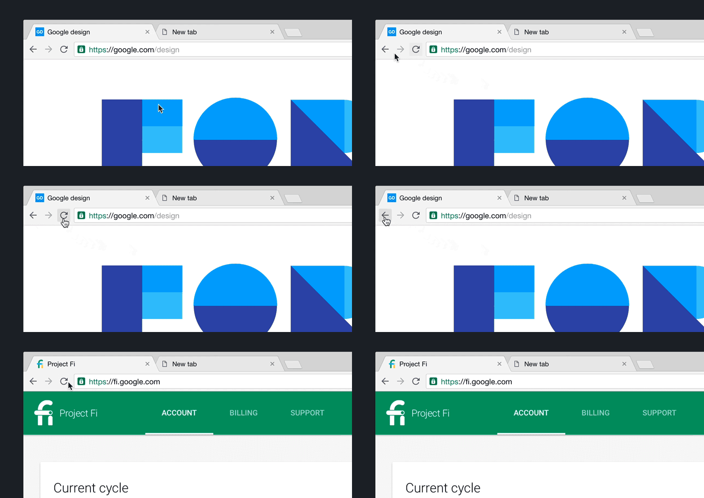
- Hover state
- Active state
- Single click/tap (onClick-release)
- Single click/tap to active
- Long click/tap to active
2
2 reads
What’s next
After the completion of the Implementation-Ready Specs and Mocks for the core UI, I dabbled a bit in chrome’s secondary UI.
We include in that category every chrome element not directly visible such as menus, Dialogs, bubbles, buttons, Info-Bars, Find-In-Page and Download shelf.
2
2 reads
Lessons learned and initial release feedback
As a closing note, I’d like to share some of the lessons I learned during this project as well as some release reaction, both internal and external, hoping that these will be helpful to you, in your projects.
2
3 reads
1. Engineers are great designers
Programmatic rendering and motion design were crucial in getting the design right.
If you are lucky enough to be working with motivated and engaged engineer, you might realize that they can sometimes be a better designer than you.
2
4 reads
2. Involve engineers early
In the present case, they were involved right away and were an integral of the design and conception process.
Engineers' motivation to deliver better design through better engineering solution made the product what it is today.
Maintaining constant communication was key to bring the right design to life.
3
5 reads
3. Know when to be precise, learn when to be loose
Delivering extremely precise spec work is necessary, however, in some cases, leaving your preliminary work open for feedback and new ideas can bring your design to another level.
As long as your end design stays true to its original goal or intent, let others enter your process and improve on your design.
3
5 reads
4. Beware of change aversion
I won’t lie, I do not have the miracle solution to it but there are things that you can do to minimize change aversion:
- Always have a deck ready to explain your vision to your audience.
- Stay the course. It is very beneficial to strongly believe in the choices you made. Don’t get stubborn but stay confident.
- Be prepared to back up your design decisions with facts, studies or past experiences. If you cannot answer back, you might find that their feedback is worth considering.
- The bigger the product, the longer it might take.
2
2 reads
5. Manage your expectation
The biggest improvements brought by this redesign project are under the hood. Finding satisfaction in your work and the result through your own eyes is more important than seeking validation through others.
If you are truly and honestly satisfied with what you have done. You’re good.
2
4 reads
IDEAS CURATED BY
Julie Hicks's ideas are part of this journey:
Learn more about product with this collection
Essential product management skills
How to work effectively with cross-functional teams
How to identify and prioritize customer needs
Related collections
Similar ideas
Read & Learn
20x Faster
without
deepstash
with
deepstash
with
deepstash
Personalized microlearning
—
100+ Learning Journeys
—
Access to 200,000+ ideas
—
Access to the mobile app
—
Unlimited idea saving
—
—
Unlimited history
—
—
Unlimited listening to ideas
—
—
Downloading & offline access
—
—
Supercharge your mind with one idea per day
Enter your email and spend 1 minute every day to learn something new.
I agree to receive email updates
