More Aggregation, More Assumptions of Causality
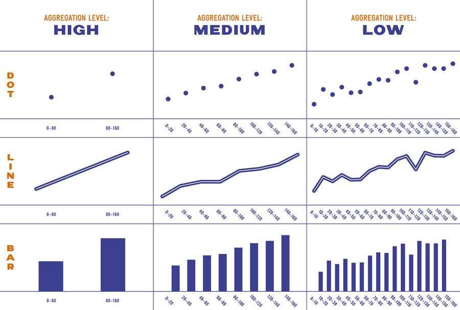
The same experiment was done, this time they developed bar charts, line charts, and scatterplots with three different levels of aggregation.
This time the type of chart had only a small effect on participants’ ratings of causality. Much more significant, however, was the effect of aggregation level. Across all different visualization styles, people saw aggregated data as more causal than less aggregated data.
4
10 reads


The idea is part of this collection:

Learn more about marketingandsales with this collection
How to analyze churn data and make data-driven decisions
The importance of customer feedback
How to improve customer experience
Related collections


Similar ideas to More Aggregation, More Assumptions of Causality
Line Charts, Circles and Bars 📈📊
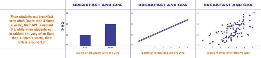
An experiment was done to find out whether these styles(bar charts, line charts, scatterplots, and plain text) differ in how "casual" they make the data appear to people.
4 correlations were chosen to display visually. 4 different visualizations for each scenario.
Each participant...
Read & Learn
20x Faster
without
deepstash
with
deepstash
with
deepstash
Personalized microlearning
—
100+ Learning Journeys
—
Access to 200,000+ ideas
—
Access to the mobile app
—
Unlimited idea saving
—
—
Unlimited history
—
—
Unlimited listening to ideas
—
—
Downloading & offline access
—
—
Supercharge your mind with one idea per day
Enter your email and spend 1 minute every day to learn something new.
I agree to receive email updates