button type="button" Or href="#"
Developers often use anchor link to mark up interactive elements. The idea behind this is override the default link using JS and they will get button behavior.
At first glance, this makes sense. But there is a problem. Browsers still think it’s a link & right clicking it open the context menu of such an element, with options: “Open in a new tab”, “Open in a new window”, & “Open in a private window”.
When users see those items, they think that it is a link and they can open it, for example, in a new tab. When they do this, they get an unexpected result – they see the top of the page.
7
32 reads
CURATED FROM
IDEAS CURATED BY
The idea is part of this collection:
Learn more about computerscience with this collection
Understanding machine learning models
Improving data analysis and decision-making
How Google uses logic in machine learning
Related collections
Similar ideas to button type="button" Or href="#"
Assumption questions
You can use them to guide the conversation in a way that leads a person to open up.
- How they work: you make assumptions about someone based on your observations and see if you are right or not.
- How they help you: these questions show that yo...
They Saw Our Destiny Path
Whereas the twin is not real life, but just a scenario in the future. Inactive, not alive, just a shadow, a future.
They think it’s alive because compared to the current circumstances and current time here, the parallel nature is also sequentially.
As if you take a train through a l...
Habits and process are more important for success
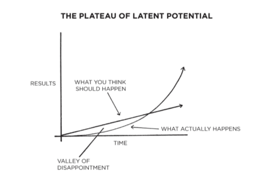
- Habits are so underrated because of their under the hood behaviour and our shitty observation because they often don't make any significant difference in our life unless we unlock a new level of performance.
- We think we will get linear progress as we go along with our practice
Read & Learn
20x Faster
without
deepstash
with
deepstash
with
deepstash
Personalized microlearning
—
100+ Learning Journeys
—
Access to 200,000+ ideas
—
Access to the mobile app
—
Unlimited idea saving
—
—
Unlimited history
—
—
Unlimited listening to ideas
—
—
Downloading & offline access
—
—
Supercharge your mind with one idea per day
Enter your email and spend 1 minute every day to learn something new.
I agree to receive email updates

