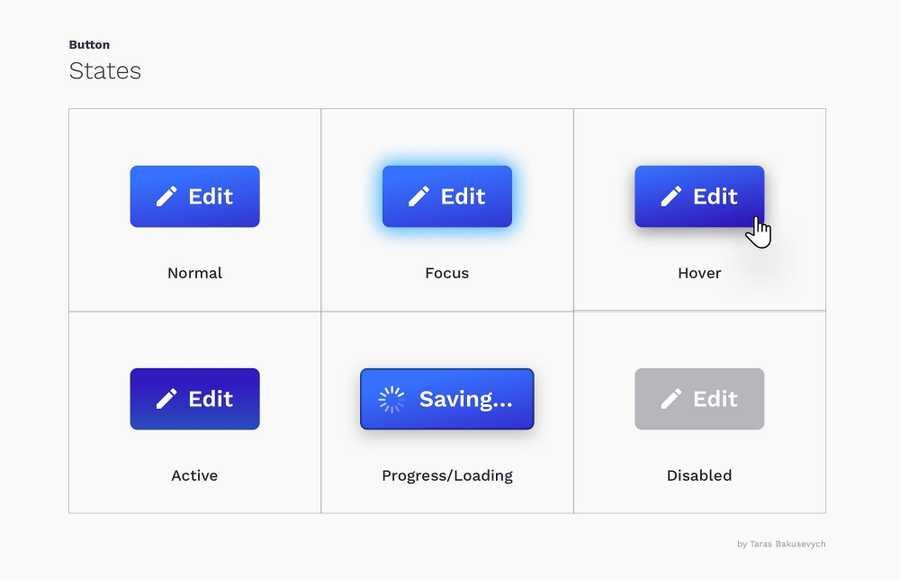
Learn more about product with this collection
How to analyze churn data and make data-driven decisions
The importance of customer feedback
How to improve customer experience
5
2 reads
MORE IDEAS ON THIS
Keep in mind how important it is to make the interface obvious for users, not creating puzzles or mazes.
Based on years of using various devices and other products, we have formed a certain expectation of how buttons look and function. A big deviation from what is cons...
4
1 read
Generally, you want to make the most commonly selected button the “default” (use primary styles) and put it in a focused state. This helps the majority of users finish their tasks faster and points them in the right direction.
The exception is when all choices are e...
4
2 reads
What your buttons say is as important as how they look. Using the wrong label can cause users confusion, loss of time, and possibly some big mistakes.
A good button label invites users to take action. Best to use verbs, and label the button with what it actually does. It's like the button i...
4
0 reads
Disabled controls are used to indicate a component is currently noninteractive but can be enabled in the future. Disabled buttons are used because removing the button from its native location and revealing it in a later context could confuse users.
4
1 read
Buttons communicate actions that users can take. They are typically placed throughout your UI, in places like: Dialogs, Forms, Toolbars, etc. The distinction between buttons and links matters:
5
4 reads
Styles are primarily used to differentiate more important actions from less important ones.
Create a hierarchy of actions that will guide the user where there are multitudes of choices. Usually, you can have a single prominent button(that style is often called “primary...
4
0 reads
Both are just choices, and designers can argue for hours about their preferences.
4
1 read
Consistency improves speed and accuracy, helps avoid errors. Create predictability that helps users feel in control and capable of achieving their goals in your product.
When you creating primary, secondary and tertiary styles try to find some common elements like color, s...
4
0 reads
Gestures let users interact with the application using touch. Using touch as another way of performing a task can save time and give tactile control.
As some gestures like swipe to trigger contextual actions, double-tap to like or long-press, being used more widely every d...
5
1 read
Most common are rectangular buttons with rounded corners, that are easily identifiable and look good next to the input field.
Choosing the right style for the button will depend on the purpose, platform, and guidelines. Here are some of the most popular style variations:
4
1 read
Pressing a button should be a simple task and if a user is unable to successfully tap on a button or in the process tap on a neighboring element by mistake, it will lead to a negative experience and loss of time.
For most platforms, consider making touch targets at least 48...
4
0 reads
CURATED FROM
Read & Learn
20x Faster
without
deepstash
with
deepstash
with
deepstash
Access to 200,000+ ideas
—
Access to the mobile app
—
Unlimited idea saving & library
—
—
Unlimited history
—
—
Unlimited listening to ideas
—
—
Downloading & offline access
—
—
Personalized recommendations
—
—
Supercharge your mind with one idea per day
Enter your email and spend 1 minute every day to learn something new.
I agree to receive email updates