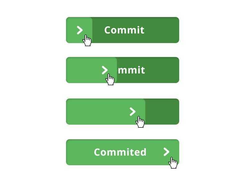
Disabled buttons suck
Disabled controls are used to indicate a component is currently noninteractive but can be enabled in the future. Disabled buttons are used because removing the button from its native location and revealing it in a later context could confuse users.
4
1 read
CURATED FROM
IDEAS CURATED BY
The idea is part of this collection:
Learn more about product with this collection
How to analyze churn data and make data-driven decisions
The importance of customer feedback
How to improve customer experience
Related collections
Similar ideas to Disabled buttons suck
The future of confirmed action
At first, a better button design was the response to the flat design trend. Buttons were less like buttons and could cause unintentionally harmful actions.
But with virtual reality, augmented reality, wearables, and gesture/voice-based interfaces of all kinds, we are moving to a future wher...
Read & Learn
20x Faster
without
deepstash
with
deepstash
with
deepstash
Personalized microlearning
—
100+ Learning Journeys
—
Access to 200,000+ ideas
—
Access to the mobile app
—
Unlimited idea saving
—
—
Unlimited history
—
—
Unlimited listening to ideas
—
—
Downloading & offline access
—
—
Supercharge your mind with one idea per day
Enter your email and spend 1 minute every day to learn something new.
I agree to receive email updates
