The perfect link
Curated from: a11y-collective.com
Ideas, facts & insights covering these topics:
11 ideas
·527 reads
3
Explore the World's Best Ideas
Join today and uncover 100+ curated journeys from 50+ topics. Unlock access to our mobile app with extensive features.
What’s in a link, anyway?
The link, these tiny things that we use in many places, in a sentence, as a nav link or even embedded in a call to action; but the common purpose between them are thus clicking a link could:
- Take the user:
- To a different location on the same page (an internal link)
- To another page on the same website
- To a page on another website
- Download a file
- Open an e-mail programme
- Dialling a telephone number
13
219 reads
Open in a new window or a new tab?
the best thing is to give users control rather than making decisions for them. A browser’s standard (default) behaviour is always the most predictable and is what users expect.
That said, it’s perfectly all right to open a link in a new window or tab, as long as you let the user know that that’s what will happen. For instance you can add “Opens in a new window” to the text of the link.
12
48 reads
The Golden Rule
Compare these two sentences:
- Click here to learn more about the Wadden Sea.
- Learn more about the Wadden Sea.
The first link text is meaningless, you have to read the whole sentence to understand what the click here is about. The second link text does that right away.
Visitors scan web pages for what they are looking for. Links stand out in the text, so make the text about where they lead. A link text should rather serve as a teaser, as clickbait for the scanning visitor.
So keep in mind that the golden rule is "Make link text meaningful and understandable on their own"
13
58 reads
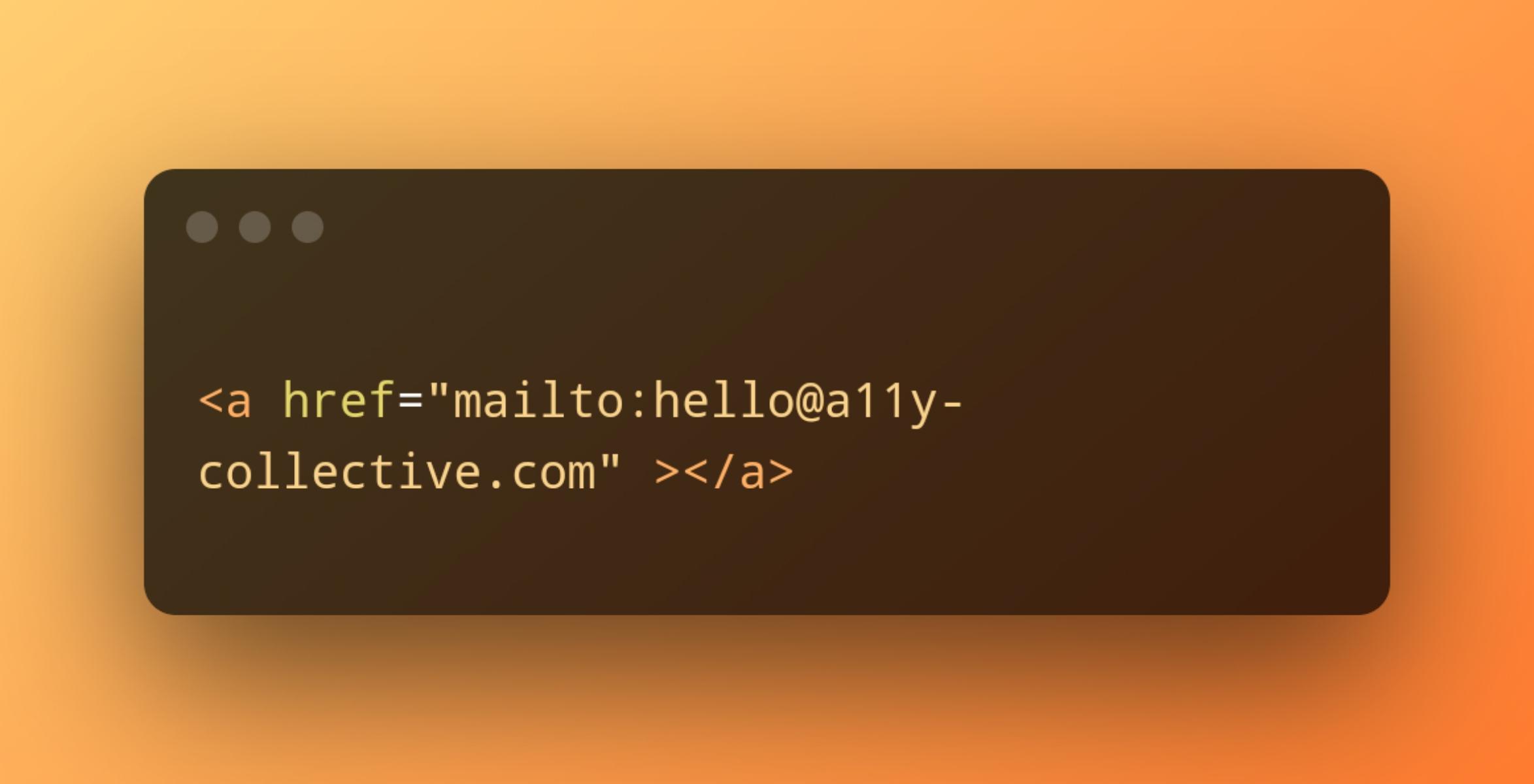
Linking to an e-mail address or a telephone number
Compare these two ways of linking:
- Please don’t hesitate to e-mail or to call us.
- Please don’t hesitate to send a message to [email protected] or to call us at +31 (0)10 842 92 59.
In the first sentence, the actual e-mail address and telephone number are hidden. This will be a problem if someone wants to send an e-mail or make a call from another device than they one they’re now using. Showing the e-mail address or the number means the user can note it down for later reference, for instance.
12
59 reads
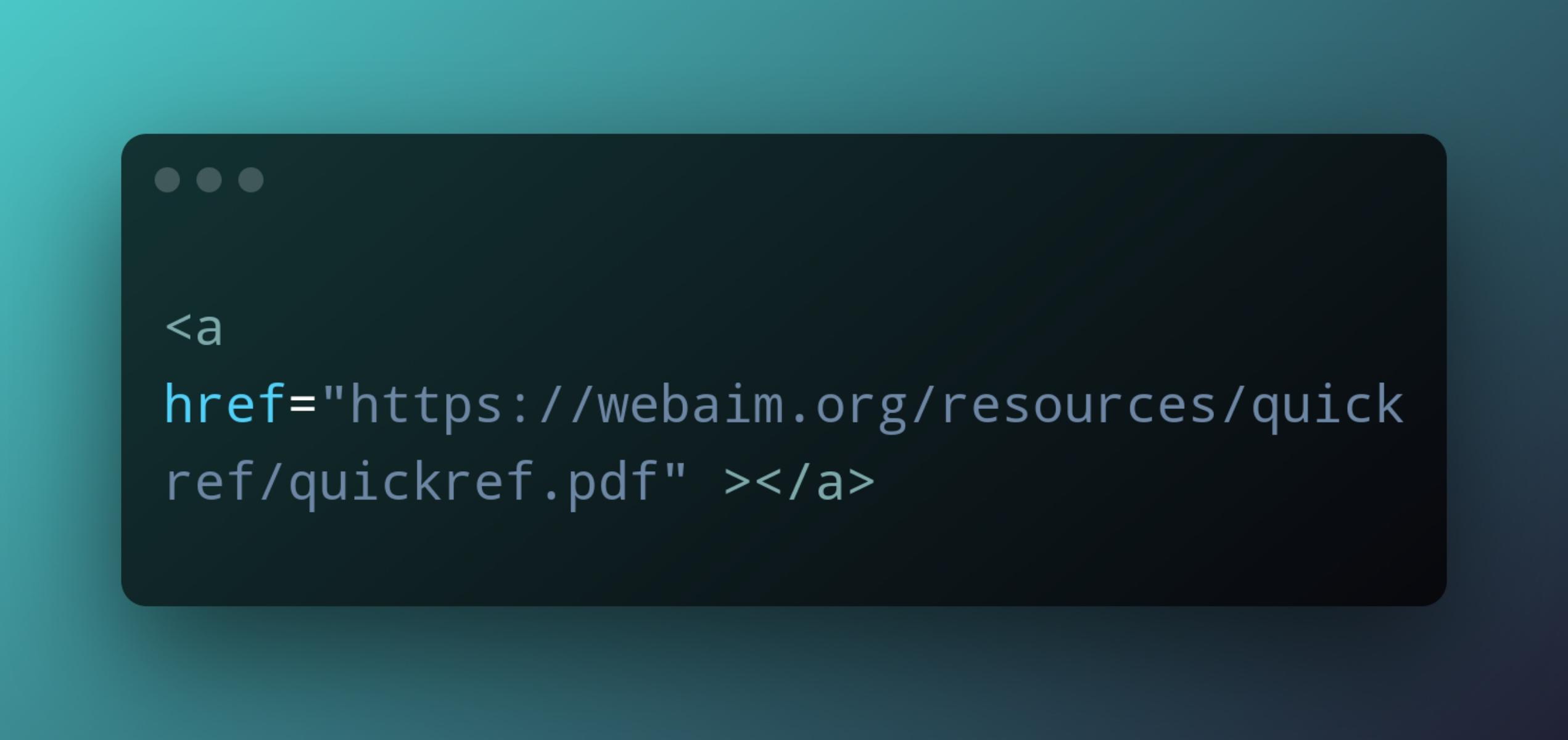
Linking to a file
How do you link to a file to be downloaded such as a PDF, a restaurant menu or a fact sheet, let’s say
Compare these two ways of linking a document:
- WebAIM Quick Reference: Web Accessibility Principles.
- WebAIM Quick Reference: Web Accessibility Principles (PDF, 327 Kb).
The first link looks like a normal link, but clicking it actually starts downloading a file. The second one lets the user know that clicking the file will start downloading a file, and tells them how big it is. If they’re on a train, for instance, they may wait until later before downloading. A link is a promise, not a surprise.
10
34 reads
Embedding an image in a link
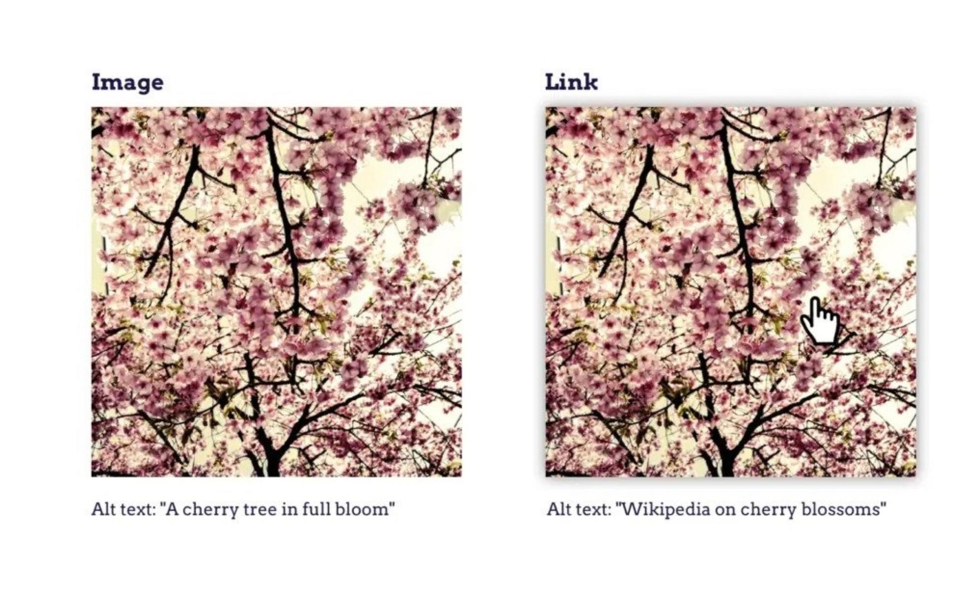
In some cases we want to add an image as a link and to be satisfied with the accessibility's aspect we will add some alt text that will describe our image.
but there is a tiny issue that will face our users that suffering from impaired vision when using a screen reader to read this text out loud, the alt text doesn't tell that image is a link,.
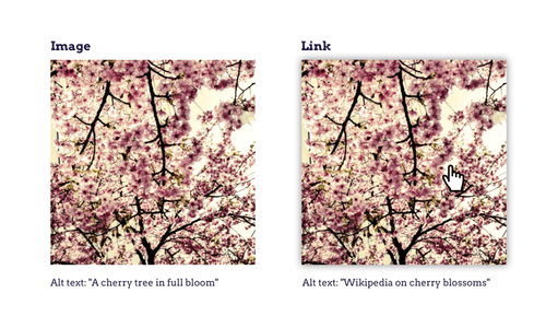
Take an image of a cherry tree, for instance:
- The image on the left is the wrong usage in our situation because it doesn't tell the truth
- The image on the right tell our user "Hey, i'm a link"
9
27 reads
When to underline a link?
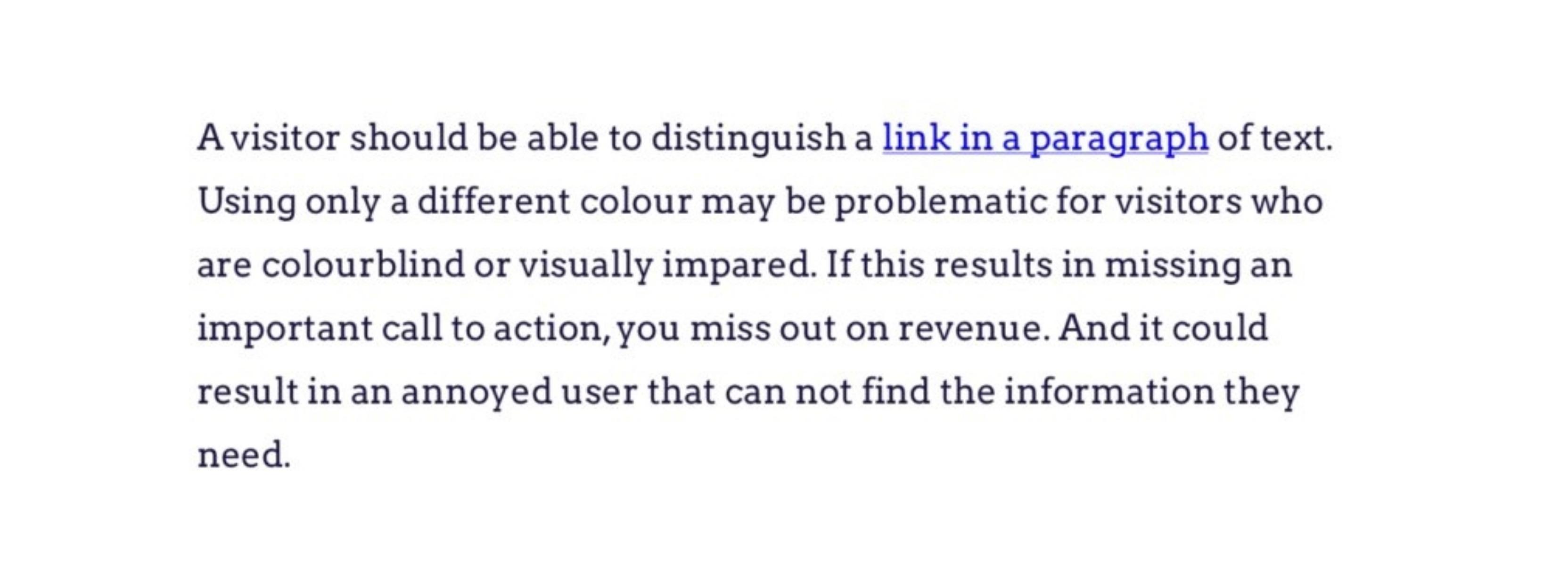
Underlining is the universal pattern for a link. Users get it right away. So use this pattern for links in paragraphs of text.
Links that are obviously links, such in navigation menus, don’t have to be underlined.
Oh, don't forget to read the image 😘
7
21 reads
Design tips for links
- Make links large enough, and include enough space between them and other links, so they are easy to click for a visitor with Parkinson’s disease or rheumatism.
- Make sure the colour-contrast ratio between text and background is at least 4.5:1 and, for the underlining itself at least 3:1. Googling colour contrast analyser will bring up plenty of free tools and add-ons that will calculate the contrast ratio for you.
4
20 reads
Semantics matters
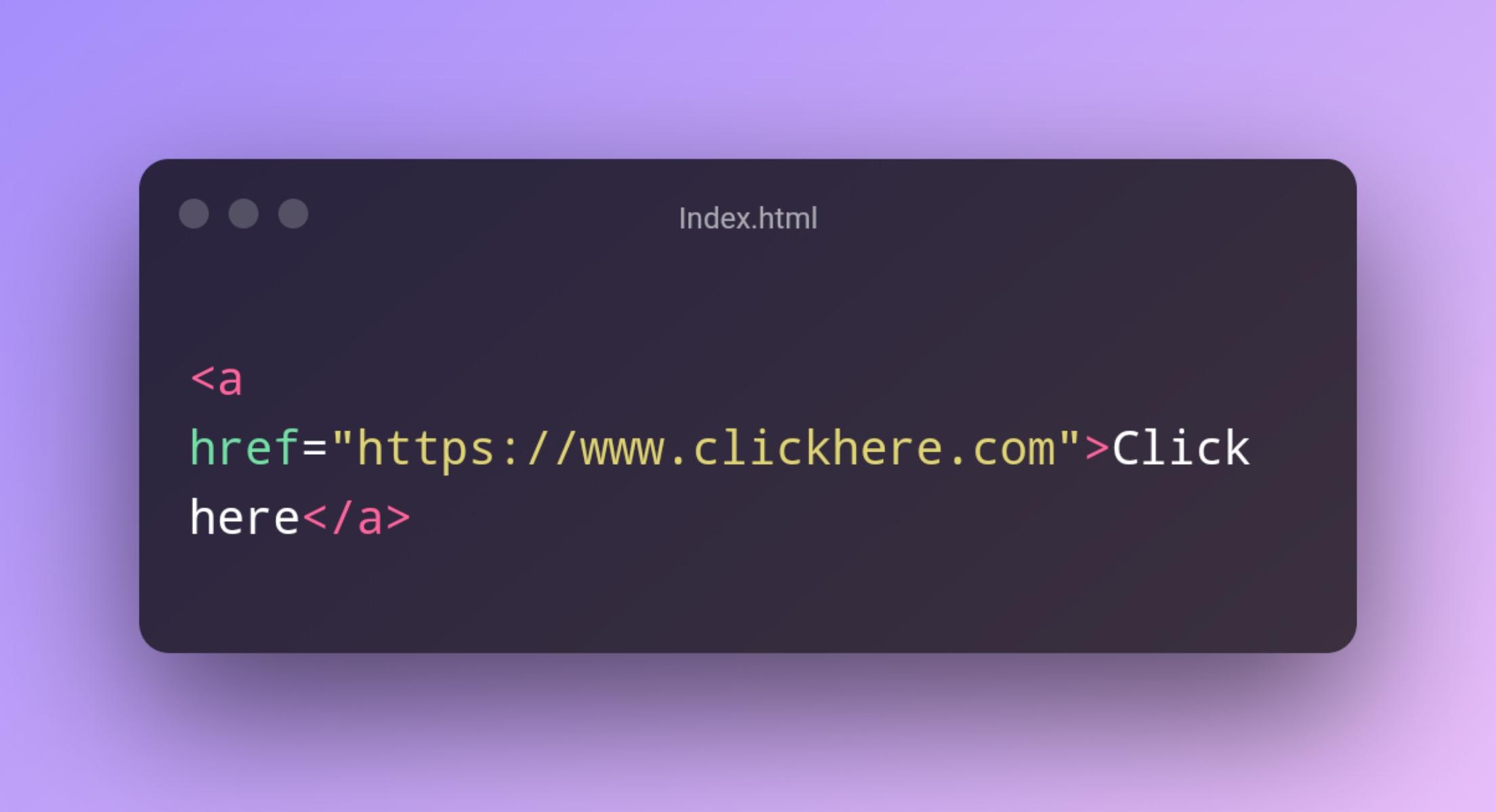
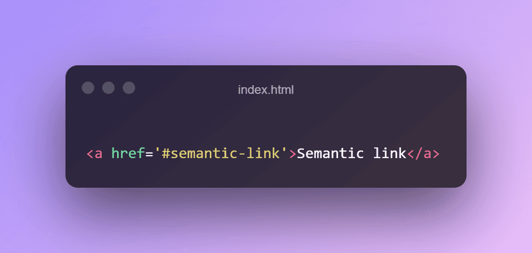
To make sure a link will work properly, use an <a> element, with an href containing a url. That way, all devices will know how to operate the link. Keyboard interactions, hover and focus, default styling and feedback
3
19 reads
Giving It A Name
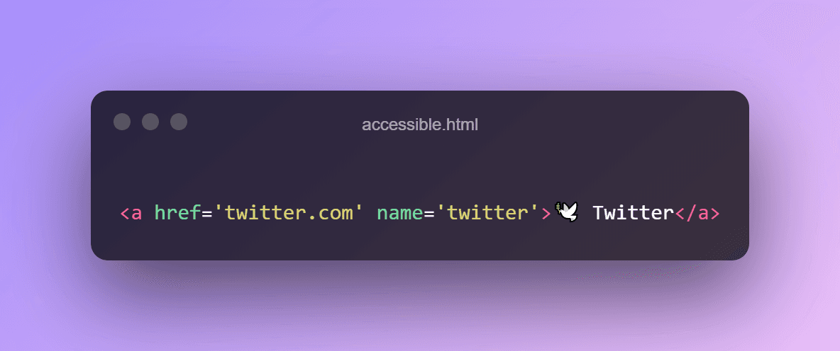
Screen readers announce the content on a website, so there must be actual content to announce, in the form of text: an “accessible name”, as it is called.
There are several ways to add the accessible name to a link, for example:
- Use an image or font icon and add the word “Twitter” to the link. This is also useful for people who don’t know what the icon means.
- Embed the image in the link – say, the Twitter logo – and give the image the alternative text “Twitter”.
- Give the link its accessible name replaces the announcement of the content (or missing content) inside the link.
3
11 reads
Internal links
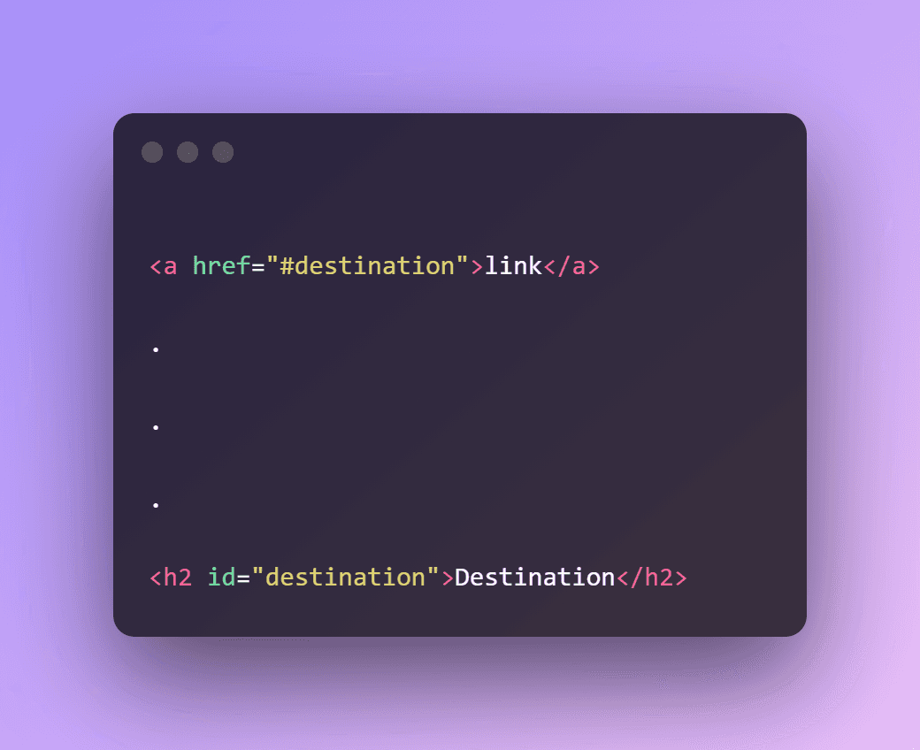
To jump to a different point on the same webpage. That’s convenient for the visitor, who can skip large parts of the page and go straight to the content they’re interested in.
But take care to not only the visual but the keyboard focus should move to the destination. Modern browsers do this by default. Older browsers need a tabindex= “-1” on the destination element to receive the focus. The best way to check this is to test it with an actual keyboard.
1
11 reads
IDEAS CURATED BY
Similar ideas
Read & Learn
20x Faster
without
deepstash
with
deepstash
with
deepstash
Personalized microlearning
—
100+ Learning Journeys
—
Access to 200,000+ ideas
—
Access to the mobile app
—
Unlimited idea saving
—
—
Unlimited history
—
—
Unlimited listening to ideas
—
—
Downloading & offline access
—
—
Supercharge your mind with one idea per day
Enter your email and spend 1 minute every day to learn something new.
I agree to receive email updates
