What Colors Do SaaS Companies Use For Buttons?
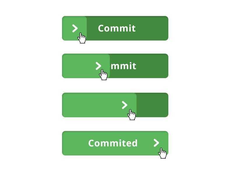
When analyzing the various call to actions there was a clear trend towards green and orange buttons.
3
12 reads
The idea is part of this collection:
Learn more about business with this collection
The impact of opportunity cost on personal and professional life
Evaluating the benefits and drawbacks of different choices
Understanding the concept of opportunity cost
Related collections
Similar ideas to What Colors Do SaaS Companies Use For Buttons?
The display of colors
The colours of a aurora boralis are pink, green, yellow, blue, violet, and occasionally orange and white.
- When the particles mix with oxygen, yellow and green are produced.
- When the particles interact with nitrogen, red, violet, and blue colours are produce...
Colors influence productivity
- Red: Impart a boost of energy.
- Yellow: The sunny shade stimulates creativity.
- Purple: Stimulates problem solving abilities.
- Green: Calms the mind, causes zero strain to the eye and is ideal for th...
The future of confirmed action
At first, a better button design was the response to the flat design trend. Buttons were less like buttons and could cause unintentionally harmful actions.
But with virtual reality, augmented reality, wearables, and gesture/voice-based interfaces of all kinds, we are moving to a future wher...
Read & Learn
20x Faster
without
deepstash
with
deepstash
with
deepstash
Personalized microlearning
—
100+ Learning Journeys
—
Access to 200,000+ ideas
—
Access to the mobile app
—
Unlimited idea saving
—
—
Unlimited history
—
—
Unlimited listening to ideas
—
—
Downloading & offline access
—
—
Supercharge your mind with one idea per day
Enter your email and spend 1 minute every day to learn something new.
I agree to receive email updates

