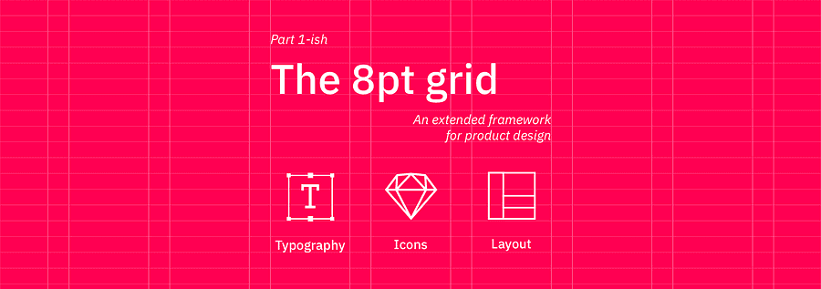
Start your UI project right
... using the extended framework for the 8pt grid: Typography, Icons and Layout.
The 8 point grid is the best go-to grid and can be applied to most digital design projects, especially product design.
6
46 reads
CURATED FROM

IDEAS CURATED BY

The idea is part of this collection:

Learn more about with this collection
How to focus on the present moment
How to cultivate empathy and understanding towards others
How to set personal and professional goals
Related collections

Similar ideas to Start your UI project right
Designers have different strengths
These strengths should be applied to the right problems.
Design encompasses many things, including:
- Visual design: typography, contrast, hierarchy, and the good ol’ does it look good? falls into this category. Are the details crisp or are they sloppy?
Start With the Right Perspective
If you’re convinced that finding your passion is hard, or that it’s not going to happen for you, you’ll remain closed to possibilities.
Choose to adopt the perspective that you can do what you love with your life. One of the best ways to strengthen this point of view is...
Reinforce Customer Choice By Highlighting Your Best Features
People experience a range of emotions as they first hear about, research, and decide to invest in a product. Throughout this journey, it’s important to reinforce their interest, especially in those moments after the purchase.
Many digital companies accomplish this through a virtual “tour” ...
Read & Learn
20x Faster
without
deepstash
with
deepstash
with
deepstash
Personalized microlearning
—
100+ Learning Journeys
—
Access to 200,000+ ideas
—
Access to the mobile app
—
Unlimited idea saving
—
—
Unlimited history
—
—
Unlimited listening to ideas
—
—
Downloading & offline access
—
—
Supercharge your mind with one idea per day
Enter your email and spend 1 minute every day to learn something new.
I agree to receive email updates