Explore the World's Best Ideas
Join today and uncover 100+ curated journeys from 50+ topics. Unlock access to our mobile app with extensive features.
Pt = point
We use small artboards while the devices we design for are huge. For example:
- The iPhone XR has a Retina display that has twice as many pixels per inch (ppi) as a regular screen, meaning the artboard is rendered at twice as many pixels.
- On the iPhone X, the artboard is rendered at 3 times as much, since it has a Super Retina display and 3 times as much ppi.
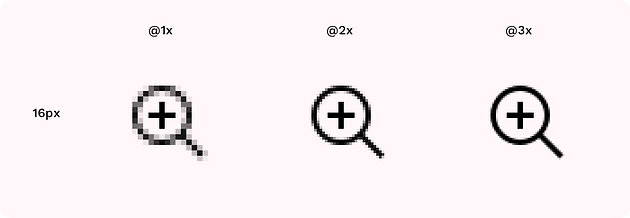
Designing for the smallest size allows scaling assets into the various sizes the different devices require while maintaining pixel-perfect rendering. 1 pt can be translated into 1,4 or 9 pixels at the @1x, @2x, and @3x sizes.
7
30 reads
Why the 8pt grid
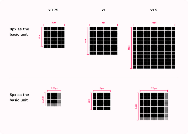
- It scales perfectly in all the different screen displays (including android’s @0.75 and @1.5).
- Apple and Google advise so.
- It's a good basic unit to work with. 4 and 8 are easily multiplied, are flexible and consistent.
7
30 reads
Typography
While the font sizes can vary and move away from the 8 multiplication, the line height will not.
For example, the Paragraph font size can be 15 pixels, but the line height should be a multiplication of 8, so 24px is an acceptable value.
7
25 reads
Iconography
Icons designed on an 8pt based grid will scale perfectly.
If you want to use icons in a different size, one recommendation is to design on a 16 x 16 pixel grid or a 20 x 20 grid. This way, you're covered for any size:16, 20, 24, 32, 40 etc.
7
21 reads
Horizontal Rhythm
The standard Bootstrap grid is a 12 column layout, with a 15px margin on each side of the column, resulting in a 30px gutter between columns plus 15px to the left and right of the grid.
The entirety of the grid is called Container. A container can be either fluid or responsive in size. A fluid container will always take the whole available width.
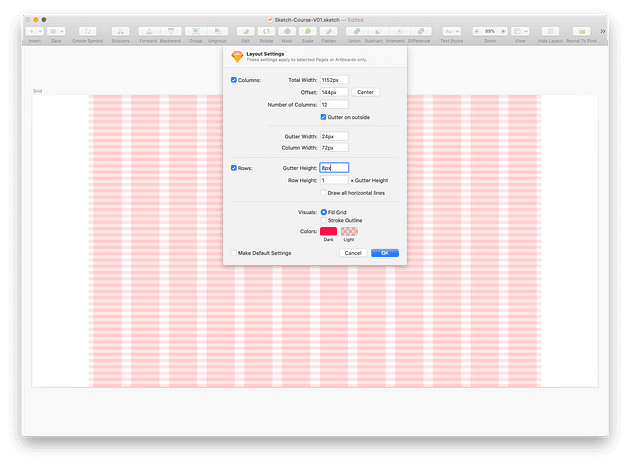
- Customising for a desktop: Each column should be 72px wide, with a gutter of 24px or 32px.
- Designing for mobile is up to you: Not all mobile devices' width dimension is divisible by 8. 12 columns aren't practical for narrow screens.
7
14 reads
Vertical Rhythm
Rows should be 8px tall.
Maintaining a vertical rhythm when designing for mobile (web or apps) is vital since there isn’t much horizontal rhythm to work with.
A typographic system that is designed based on the 8pt grid will sit wonderfully on an 8pt vertical grid.
8
13 reads
Start your UI project right
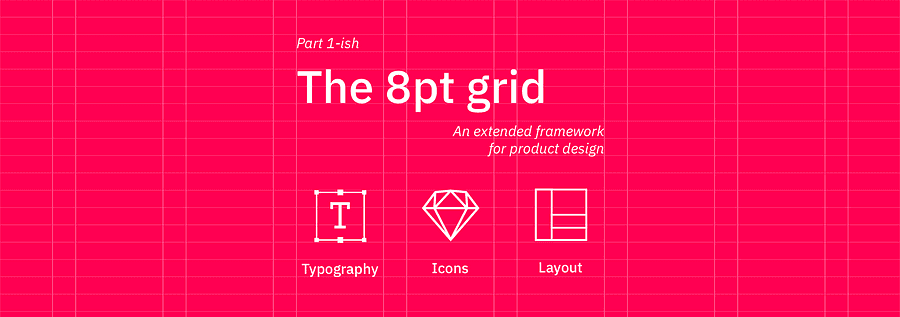
... using the extended framework for the 8pt grid: Typography, Icons and Layout.
The 8 point grid is the best go-to grid and can be applied to most digital design projects, especially product design.
6
46 reads
IDEAS CURATED BY
Matthew Clark's ideas are part of this journey:
Learn more about product with this collection
How to focus on the present moment
How to cultivate empathy and understanding towards others
How to set personal and professional goals
Related collections
Similar ideas
10 ideas
10 Mental Blocks to overcome - Big Think
bigthink.com
2 ideas
The Trouble with Optionality
thecrimson.com
7 ideas
Why America’s Blood Plasma Trade is Rising (And What the Hell That Says About Us)
vertexviews.wordpress.com
Read & Learn
20x Faster
without
deepstash
with
deepstash
with
deepstash
Personalized microlearning
—
100+ Learning Journeys
—
Access to 200,000+ ideas
—
Access to the mobile app
—
Unlimited idea saving
—
—
Unlimited history
—
—
Unlimited listening to ideas
—
—
Downloading & offline access
—
—
Supercharge your mind with one idea per day
Enter your email and spend 1 minute every day to learn something new.
I agree to receive email updates


