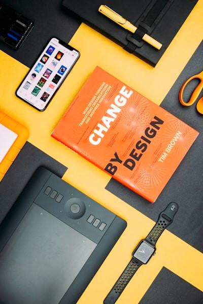
Learn more about product with this collection
Essential product management skills
How to work effectively with cross-functional teams
How to identify and prioritize customer needs
Plain has more connotations with negative feelings as it can sometimes indicate ‘boring’ while simple is positive as it is most often associated with minimalistic modern design.
Simple is about functionality and means that a product is easy to use, and sometimes “simple” can be much more engaging than you’d expect.
Good design is simple but not plain — strive for simple without settling for plain.
29
136 reads
MORE IDEAS ON THIS
Using more than two typefaces can make design in-cohesive and messy. Instead, add different weights (light, regular, bold) and sizes of the same font to make it more attractive.
Beyond that, play around with the layout, fill the negative space with text and images.
Accent colours are ...
27
78 reads
A simple design takes away unnecessary functions, including text, CTA’s, images etc. The user should still achieve their goals but not be bombarded by visual and written content.
The goal of design is to make it straightforward and engaging without making it dull.
30
137 reads
Illustrations and animations in empty areas can entirely enhance designs and make them much more enjoyable. We crave visuals, and hence animations are much more entertaining. These are great to make monotonous screens more interesting.
29
84 reads
Using a lightly coloured background that complements your accent colours can make everything pop.
Understanding colour theory has its benefits. For instance, instead of using white as a background, using a light tint of orange can make your other accents of orange pop.
Using light tin...
25
78 reads
Letting items breathe on a page is a must when designing minimalist designs.
Apple is an excellent example of the quote “less is more” and showcases that their design is the product itself, not the website. They have conf...
28
123 reads
Cognitive load is the amount of information our working memory can hold at any time. An overload of information can drive users away instead of drawing them in. Not everything has to be laid out on the landing page of a website; that is why menus exist. The information stays hidden unless and unt...
30
98 reads
Most designers are familiar with Dieter Rams’ principle “Good design is as little design as possible.”
Quote “it’s plain and simple” is a common phrase, but what does that actually mean?
In fact, many designers strive to create things with a “simple” design or even ones that are see...
31
165 reads
Choice can be overwhelming for everyone. As mentioned earlier, when speaking about cognitive load, the amount of information our working memory can hold is limited.
29
90 reads
CURATED FROM
IDEAS CURATED BY
Related collections
Other curated ideas on this topic:
Journalling is a great way to start this process of being mindful.
As you are journaling, pay attention to your day.
As a species we have an in-built ‘negativity bias': a propensity to remember, cling to, and learn from negative experiences more readily than positive ones, according to neurology research.
It made sense that our earliest ancestors should be risk averse, but nowadays t...
Read & Learn
20x Faster
without
deepstash
with
deepstash
with
deepstash
Personalized microlearning
—
100+ Learning Journeys
—
Access to 200,000+ ideas
—
Access to the mobile app
—
Unlimited idea saving
—
—
Unlimited history
—
—
Unlimited listening to ideas
—
—
Downloading & offline access
—
—
Supercharge your mind with one idea per day
Enter your email and spend 1 minute every day to learn something new.
I agree to receive email updates