8. White Space
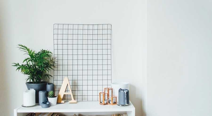
White space is the area of a design that is not filled with any visual elements. It can be used to create a sense of balance, emphasis, or movement.
41
327 reads
CURATED FROM
IDEAS CURATED BY
The fundamentals of design can be used to create a wide variety of designs form simple logos to complex websites.
“
Similar ideas to 8. White Space
How Powerful White Space Can Affect Our Daily Routine
In design, “white space” is negative space. It’s not blank space because it has a purpose. It is balancing the rest of the design by throwing what is on the page (or the screen) into relief. The white space helps focus our visual attention.
Understanding the elements and principles of art and design
The elements and principles of art and design are the foundation of the language we use when we speak about art.
- The elements of art are the visual tools an artist employs to create a composition: The elements are li...
1. Emphasis
Emphasis is the use of visual elements to create a focal point in a design. This can be done through the use of contrast, size, color, or placement.
Read & Learn
20x Faster
without
deepstash
with
deepstash
with
deepstash
Personalized microlearning
—
100+ Learning Journeys
—
Access to 200,000+ ideas
—
Access to the mobile app
—
Unlimited idea saving
—
—
Unlimited history
—
—
Unlimited listening to ideas
—
—
Downloading & offline access
—
—
Supercharge your mind with one idea per day
Enter your email and spend 1 minute every day to learn something new.
I agree to receive email updates


