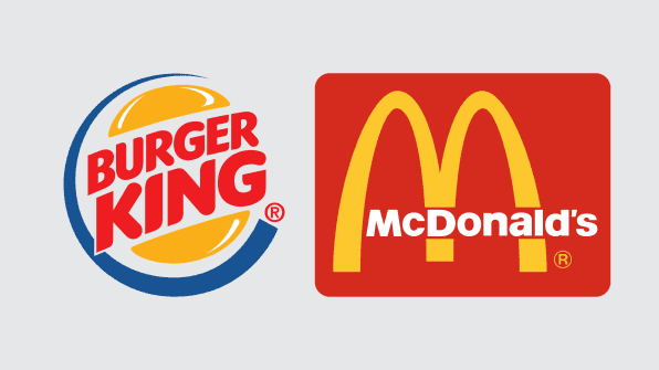
Who has a better logo?
McDonald’s is the more successful company by a mile, and its golden arches are recognizable from blocks away. But at according to a new paper published in the Journal of Marketing Research, Burger King has a better logo.
Why? Because Burger King's logo is descriptive. It literally puts a hamburger on its sign along with the word “burger.”
29
410 reads
CURATED FROM
These scientists studied 500+ logos. Here’s what they discovered about good branding
fastcompany.com
6 ideas
·1.47K reads
IDEAS CURATED BY
Digital marketing at dentsu. Invested in the symbiosis of marketing, psychology, and design. Photographer at heart.
The idea is part of this collection:
Learn more about career with this collection
How to use storytelling to influence and persuade
How to create a compelling narrative
How to structure your story for maximum impact
Related collections
Read & Learn
20x Faster
without
deepstash
with
deepstash
with
deepstash
Personalized microlearning
—
100+ Learning Journeys
—
Access to 200,000+ ideas
—
Access to the mobile app
—
Unlimited idea saving
—
—
Unlimited history
—
—
Unlimited listening to ideas
—
—
Downloading & offline access
—
—
Supercharge your mind with one idea per day
Enter your email and spend 1 minute every day to learn something new.
I agree to receive email updates
