These scientists studied 500+ logos. Here’s what they discovered about good branding
Curated from: fastcompany.com
1
Explore the World's Best Ideas
Join today and uncover 100+ curated journeys from 50+ topics. Unlock access to our mobile app with extensive features.
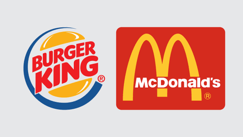
Who has a better logo?
McDonald’s is the more successful company by a mile, and its golden arches are recognizable from blocks away. But at according to a new paper published in the Journal of Marketing Research, Burger King has a better logo.
Why? Because Burger King's logo is descriptive. It literally puts a hamburger on its sign along with the word “burger.”
29
410 reads
But why?
According to the research, people respond more positively—meaning they consider brands more authentic and worthy of their money—when they have descriptive logos rather than abstract, “non-descriptive” ones like the McDonald’s arches, or even the Nike swoosh.
27
253 reads
Consider this experiment.
In one study, the authors designed a fictional mountain gear brand and a fictional sushi restaurant. Each fake brand was given two different logos: one descriptive and one abstract.
For instance, the mountain gear brand’s descriptive logo had an image of a mountain on it, and the sushi restaurant featured a sushi roll.
In the abstract versions, these shapes were changed to a black triangle for the mountain and a black cylinder for the sushi.
24
229 reads
Which one won?
The nondescriptive, geometric versions sound so modern, with enticing, flat design! They must be the better way to go, right?
In fact, subjects preferred the companies with the more literal, or descriptive, pictures. They rated them more likable and authentic.
24
196 reads
Not every brand should be descriptive.
There are cases, the researchers found, where descriptive logos are the wrong way to go—namely, if consumers don’t like your product.
In other words, if someone is buying palm oil—or perhaps bug repellent, or a funeral home service, as the authors write—keep dead bodies and bugs away from your logo, even if that is your business.
29
168 reads
Abstraction may work with a broad range of services.
Finally, the researchers speculate that brands with a broad reach of services, like Uber or Procter & Gamble, probably benefit from more abstract symbols that don’t pin them down to a single product offering. It makes sense.
28
218 reads
IDEAS CURATED BY
Digital marketing at dentsu. Invested in the symbiosis of marketing, psychology, and design. Photographer at heart.
Pranav P.'s ideas are part of this journey:
Learn more about career with this collection
How to use storytelling to influence and persuade
How to create a compelling narrative
How to structure your story for maximum impact
Related collections
Similar ideas
4 ideas
5 ideas
Read & Learn
20x Faster
without
deepstash
with
deepstash
with
deepstash
Personalized microlearning
—
100+ Learning Journeys
—
Access to 200,000+ ideas
—
Access to the mobile app
—
Unlimited idea saving
—
—
Unlimited history
—
—
Unlimited listening to ideas
—
—
Downloading & offline access
—
—
Supercharge your mind with one idea per day
Enter your email and spend 1 minute every day to learn something new.
I agree to receive email updates


