12 Visual Hierarchy Principles Non-Designers Needs to Know
Curated from: visme.co
Ideas, facts & insights covering these topics:
1 idea
·48 reads
3
Size Impacts Visibility
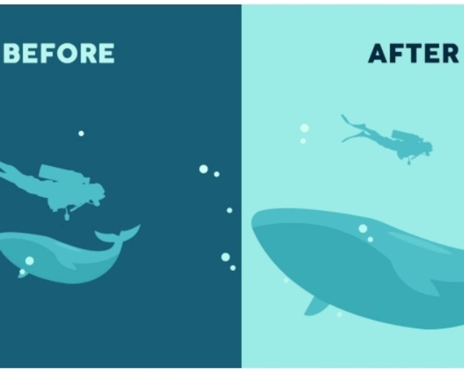
Size is arguably the most effective way to emphasize visual elements. Simply put, larger elements draw greater attention than smaller elements.
It’s the precise reason why newspaper headlines appear in larger fonts. In any design, larger elements—whether they be words or images—not only will be most noticeable, but they also will carry the strongest message.
Another important principle related to this concept is scale, the size of an object in relation to another. A large or small object, has no scale until it is compared. It allows us to create balance in design and focus on dominant elements.
2
48 reads
IDEAS CURATED BY
Experience designer and design teacher interested in well-being, accessibility and great design practices. Specialising in service design, product design and user research.
CURATOR'S NOTE
Visual hierarchy principles are key to creating effective UX and UI designs
“
Natasha Bee's ideas are part of this journey:
Learn more about problemsolving with this collection
Understanding the concept of the self
The importance of living in the present moment
The illusion of control
Related collections
Similar ideas
Read & Learn
20x Faster
without
deepstash
with
deepstash
with
deepstash
Personalized microlearning
—
100+ Learning Journeys
—
Access to 200,000+ ideas
—
Access to the mobile app
—
Unlimited idea saving
—
—
Unlimited history
—
—
Unlimited listening to ideas
—
—
Downloading & offline access
—
—
Supercharge your mind with one idea per day
Enter your email and spend 1 minute every day to learn something new.
I agree to receive email updates

