Five design trends set to visually shape 2022
Curated from: itsnicethat.com
Ideas, facts & insights covering these topics:
6 ideas
·452 reads
13
1
Explore the World's Best Ideas
Join today and uncover 100+ curated journeys from 50+ topics. Unlock access to our mobile app with extensive features.
Material You Design
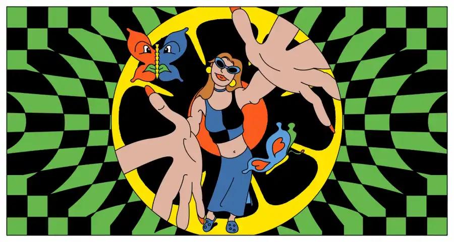
Material You signals a radical new way to think about design for the entire tech industry. Material You explores a more humanistic approach to design, celebrating the tension between design sensibility and personal preference, and not shying away from emotion.
10
164 reads
2022 Design Trends: Motion Design
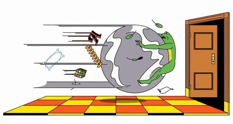
We’ve been seeing motion everywhere: flickering typography swooshes that mutate until it comes together to form the name of a brand that wants to reflect its dynamism; squishy shapes wiggle and buoyant logos bob to hint at a devil-may-care, cheerful personality.
In 2022, motion cannot be an afterthought. Instead, it will become the centrepiece of a project, a lens through which designers start viewing the infinite possibilities of crafting a brand story that is far more dynamic than static images designed to warp and move.
10
77 reads
The 90s Are Back: Retro Age In 2022
This trend points at an understated intention of moving away from the hi-def, ‘perfect’ image, a sentiment that perhaps is rooted in the recent renaissance of film photography. This style feels new although it’s old. This drive to create an imperfect image definitely has something to do with the slow revival of film, the very feel of the medium which is frankly unmatchable, and the space it creates for honest mistakes.
While specific details like light leaks and fish-eye lenses might be left behind, the broader trend itself is highly adaptable, and will stand the test of time.
10
50 reads
Gooey Blobs and Liquids in 3D Art
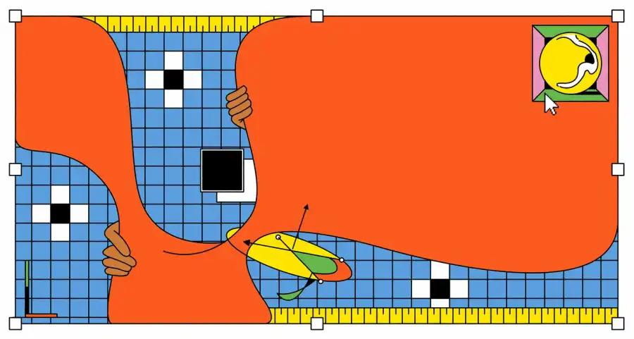
There is something about amorphous, squidgy blobs and shiny liquids in 3D and digital art that seemed very on-trend over the past year. Sugar-coloured, cushiony structures popped up on magazine covers, and hypnotic, elastic-band-like liquids shimmered and pulsated in a kind of tranced rhythm. Leaning on a sense of randomness and abstraction, these fluid and glinting organic shapes – with no sharp angles or edges in sight – shift and move like aquatic creatures, in ways that defy logic and any notions of gravity.
10
49 reads
A Nostalgic Resurgence
Techniques and ideas born in the 1890s, and seen again in the heady years of the late 90s, became recurring themes across commercial and personal projects.
With misty gradients and grainy, tactile textures, the aesthetic pull of the medium was hard to escape: one cursory scroll on Instagram and it pops up in posters, album covers and endless editorial illustrations.
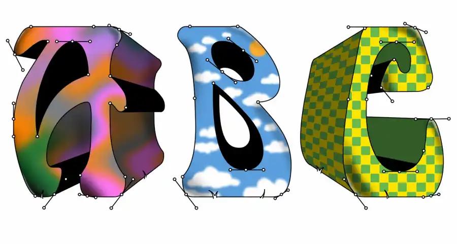
The complexity of these typefaces draws on the beauty of the eccentric graphics of the 60s and 70s, and its contemporary update, which makes it more than just a revival
11
52 reads
Intense, Retina-searing Colours
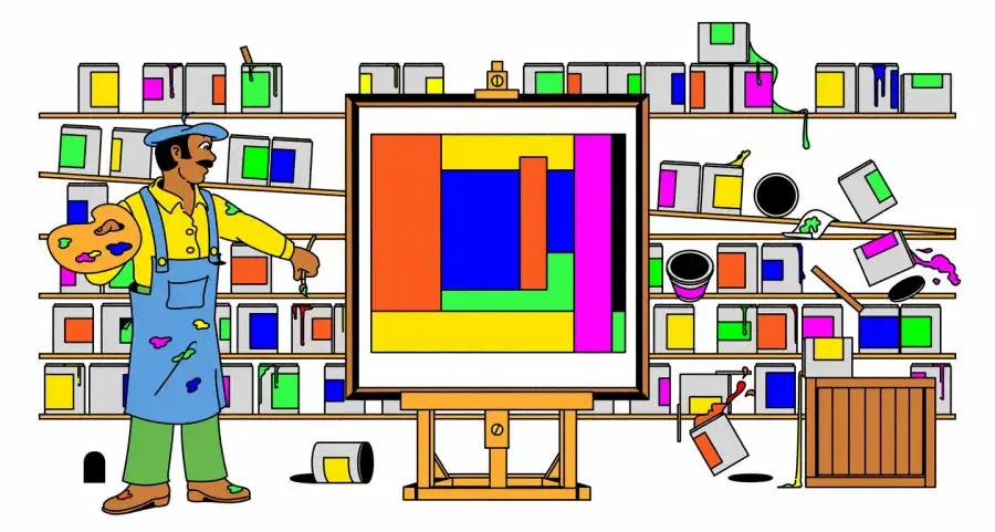
If there ever was a visual riposte to uncertain, challenging times that manifested through the reflective microcosm that is the world of design, then the recent rise in the use of dramatic, eye-searing colours was definitely it. Intense gradients and blazing hues showed up across advertising campaigns, album and book covers, identity systems and editorial design that made it almost impossible for the viewer to look away.
10
60 reads
IDEAS CURATED BY
Jenny Whitney's ideas are part of this journey:
Learn more about product with this collection
How to align stakeholders
Best practices in product management leadership
How to create value together
Related collections
Similar ideas
3 ideas
Top 10 Web 3.0 Trends and Predictions to Lookout for in 2022
analyticsinsight.net
9 ideas
7 Upcoming Web Design Trends and Inspiration in 2022 - The European Business Review
europeanbusinessreview.com
4 ideas
Read & Learn
20x Faster
without
deepstash
with
deepstash
with
deepstash
Personalized microlearning
—
100+ Learning Journeys
—
Access to 200,000+ ideas
—
Access to the mobile app
—
Unlimited idea saving
—
—
Unlimited history
—
—
Unlimited listening to ideas
—
—
Downloading & offline access
—
—
Supercharge your mind with one idea per day
Enter your email and spend 1 minute every day to learn something new.
I agree to receive email updates

