
Part - 1: Top 22 Infographics / Visualizations of 2022 - Visual Capitalist
Curated from: visualcapitalist.com
Explore the World's Best Ideas
Join today and uncover 100+ curated journeys from 50+ topics. Unlock access to our mobile app with extensive features.

Why Infographics?
Infographics are visual representations of information, data, or knowledge.
They can be used to communicate complex information quickly and clearly, often serving as a powerful tool for illustrating points or making data more accessible.
Additionally, infographics can help explain processes in an easy-to-understand way.
Get ready to be inspired and informed with top picks for the most impressive and effective infographics and visualizations of 2022 of Visual Capitalist.
1
0 reads

The $100 Trillion Global Economy in One Chart
IMF projections from earlier this year suggested that we would hit a new milestone for global economic output: $104 trillion. This voronoi diagram carves up the global economy by country.
1
1 read

Earth’s Seasons (Animated)
This animated map by Eleanor Lutz visualizes Earth’s seasons, showing how the temperature changes impact ice levels in the Arctic, as well as the growth and shifting of vegetation. It also highlights the cloud cover and sunlight each hemisphere receives throughout the year, with each frame in the animation representing a month of time.
1
0 reads

Key Facts About Ukraine
In early 2022, there was a lot of attention on Ukraine as Russian tanks were moving towards Kyiv.
In the map graphic above, Visual Capitalist examine Ukraine from a structural point of view. What’s the country’s population composition? What drives the country’s economy? And most importantly, why is the country important within a global context?
1
0 reads

World’s Largest Oil Producers
The conflict in Ukraine had broader implications on the global economy, and the world hit its first energy crisis of the 21st century. This infographic looks at where oil is actually produced around the world.
1
0 reads

10 Years of Tinder
A decade of swiping and over half a billion downloads later, Tinder still leads the market share of online dating apps in the United States at 32%.
What started as a “hook-up” app 10 years ago for college students, is now a mainstream hit that is globally used in 190 countries and 45 languages.
1
1 read

The Salary You Need to Buy a Home in 50 U.S. Cities
This graphic offers a broad view of affordability, mapping out the annual salary needed for home ownership in 50 different U.S. cities.
1
0 reads

The Relationship Between Wealth and Happiness, by Country
Of course, we humans are not just content with measuring our own happiness, but also our happiness in relation to the people around us—and even other people around the world.
Check your country!
1
0 reads

The World’s Biggest Wind Turbines (Animated)
Over the past 20 years, wind turbines have grown in size, and are now generating much more energy per unit.
Today, the tallest turbines can reach over 200 meters (650 ft) in height and cost more than $12 million to manufacture and install.
1
1 read

Problems With Media in One Chart
One of the hallmarks of democratic society is a healthy, free-flowing media ecosystem.
Unfortunately, the modern news media ecosystem is under fire from a number of angles, from a shrinking pool of ad revenue to declining trust from readers.
1
1 read

S&P 500 Performance in 2022, by Sector (Video)
Throughout the year, inflation rates have remained high and interest rates have likewise been climbing around the world. Accompanied by the looming threat of a recession, some sectors have been hit harder than others.
This animation from Jan Varsava shows U.S. dividend-adjusted stock performance for each company in the S&P 500 index in 2022, from the start of the year through the end of September.
1
0 reads

Where to Find Water on Mars (Animated)
The European Space Agency has long been looking for water on Mars, and this year it looks like they’ve found it…in rocks!
1
1 read
Recommendation
Try to check animations and videos on source link. For the rest of them, Deepstash will be enough.
1
1 read
IDEAS CURATED BY

CURATOR'S NOTE
Presenting complex information in a visual format can be a very effective way to communicate ideas and make them easier to understand. Infographics and visualizations allow you to quickly convey a lot of information in a way that is engaging and easy to comprehend.
“
Pixel8 888's ideas are part of this journey:

Learn more about sciencefiction with this collection
Effective communication
Persuasion techniques
Closing a sale
Related collections


Similar ideas
2 ideas
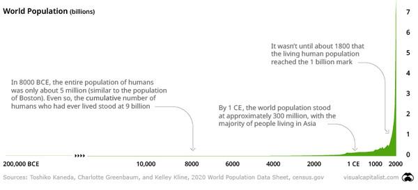
How Many Humans Have Ever Lived?
visualcapitalist.com
1 idea
World Population Clock: 7.96 Billion People (2022)
worldometers.info
1 idea
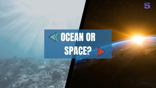
Ocean Or Space: What Have We Explored More?
Sudhir Talati
Read & Learn
20x Faster
without
deepstash
with
deepstash
with
deepstash
Personalized microlearning
—
100+ Learning Journeys
—
Access to 200,000+ ideas
—
Access to the mobile app
—
Unlimited idea saving
—
—
Unlimited history
—
—
Unlimited listening to ideas
—
—
Downloading & offline access
—
—
Supercharge your mind with one idea per day
Enter your email and spend 1 minute every day to learn something new.
I agree to receive email updates