Building a Retention Chart
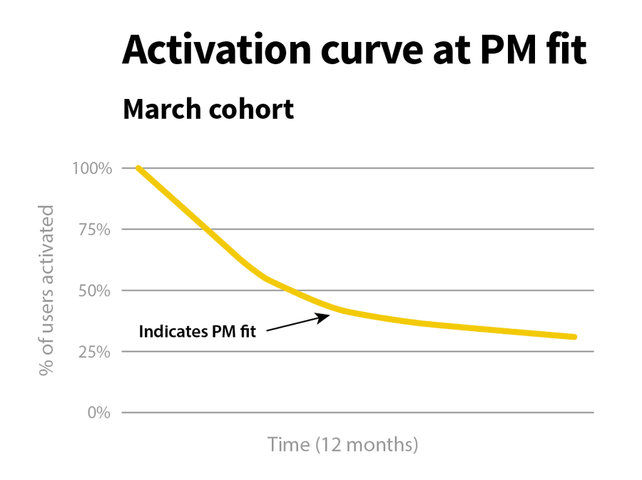
The Activation Curve shows the number of users activated over a specific period of time.
Many early-stage companies have bad retention at the start. They can get customers in but haven't figured out the mechanics to keep them around. When the metrics start to improve over time, you generally have the concept of product-market fit.
27
121 reads
CURATED FROM
IDEAS CURATED BY
The idea is part of this collection:
Learn more about business with this collection
Essential product management skills
How to work effectively with cross-functional teams
How to identify and prioritize customer needs
Related collections
Similar ideas to Building a Retention Chart
Customer Lifecycle Funnel
There are six stages the customer has to go through: Visitor->Prospect->Activated User->Customer->Active Customer->Loyal Customer.
- Each stage that a customer goes through is preceded by a specific action.
- The effectiveness of each stage needs to be tracked and ...
A Global Marketplace
American companies no longer enjoy local advantages and must now compete against companies from other countries that might have cheaper labour or less regulation. No business is safe from these changing market forces.
Technology has lowered barriers to entry, making it easier and cheaper ...
Metrics for assessing a job offer
Think about what is important in your professional and private life, then assess the offer against these metrics.
- Salary. Even when the money is enough, you need to figure out if it's worthy of your knowledge and skills and in line with the local market.
Read & Learn
20x Faster
without
deepstash
with
deepstash
with
deepstash
Personalized microlearning
—
100+ Learning Journeys
—
Access to 200,000+ ideas
—
Access to the mobile app
—
Unlimited idea saving
—
—
Unlimited history
—
—
Unlimited listening to ideas
—
—
Downloading & offline access
—
—
Supercharge your mind with one idea per day
Enter your email and spend 1 minute every day to learn something new.
I agree to receive email updates
