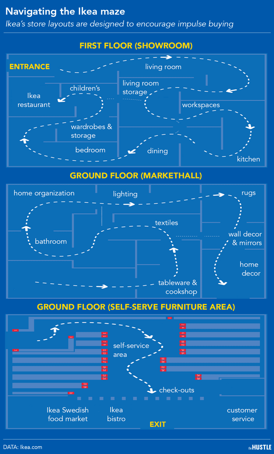
Breaking All Layout Rules
The unique one-way labyrinth design of Ikea:
Forces wider product exposure: At most retail shops, customers only lay eyes on ~33% of all the items for sale; Ikea’s layout herds shoppers past its entire catalog.
Creates a false sense of scarcity: When shoppers pass by items they’re on the fence about, they’re inclined to just put them in the cart because they don’t want to backtrack through the maze later on.
Creates a sense of mystery: Every 50 feet, the path breaks left. Shoppers never know what’s around the next turn, stoking their desire to continue exploring.
26
184 reads
CURATED FROM
IDEAS CURATED BY
The idea is part of this collection:
Learn more about business with this collection
Effective communication
Persuasion techniques
Closing a sale
Related collections
Read & Learn
20x Faster
without
deepstash
with
deepstash
with
deepstash
Personalized microlearning
—
100+ Learning Journeys
—
Access to 200,000+ ideas
—
Access to the mobile app
—
Unlimited idea saving
—
—
Unlimited history
—
—
Unlimited listening to ideas
—
—
Downloading & offline access
—
—
Supercharge your mind with one idea per day
Enter your email and spend 1 minute every day to learn something new.
I agree to receive email updates
