Explore the World's Best Ideas
Join today and uncover 100+ curated journeys from 50+ topics. Unlock access to our mobile app with extensive features.
The Retail King
Ikea has an enviable position in the struggling retail landscape. As of 2021, it boasts:
- ~$47.6B USD in annual retail sales
- 458 stores in 61 markets
- 775m store visits + 5B web visits per year
- 225k global employees
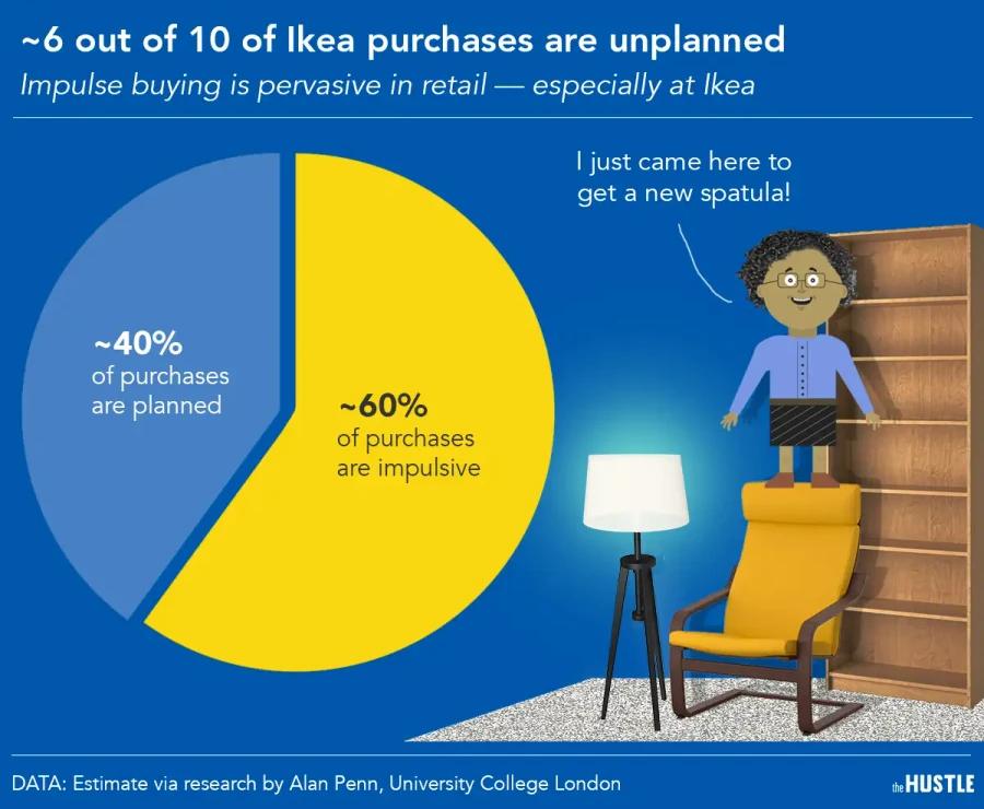
It’s estimated that 60% of Ikea purchases are impulse buys. And Ikea’s own creative director has said that only 20% of the store’s purchases are based on actual logic and needs.
25
428 reads
A Unique Retail Model
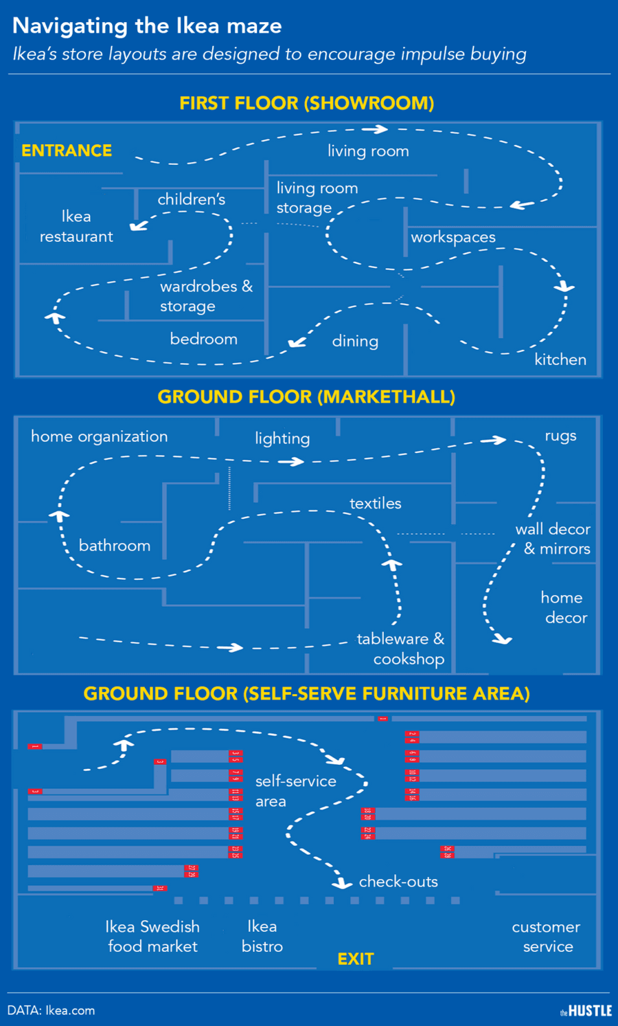
Ikea sells meatballs and lamps under the same roof. It has been described as both “Disneyland for adults” and “a nightmare hellscape.” And the idea of spending an afternoon stuck in a one-way maze — then going home and assembling your own bookcase — isn’t exactly appealing.
But these eccentricities are intentionally engineered to get you to make unplanned purchases, and come back for more.
26
232 reads
The Normal Store Layouts
In general, retailers design their stores with 3 goals in mind:
- Intelligibility: Easy to understand the floor plan
- Accessibility: Easy to navigate
- A clear visual field: Exposure to products and the lay of the land
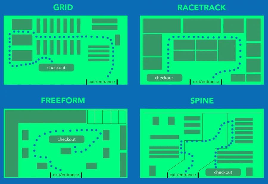
Most companies use store layouts that give customers the freedom to explore at their own will.
Commonly used configurations — grid, racetrack, freeform, and spine — don’t have defined routes: You can wander down any aisle you please, in any order you want.
27
216 reads
Breaking All Layout Rules
The unique one-way labyrinth design of Ikea:
Forces wider product exposure: At most retail shops, customers only lay eyes on ~33% of all the items for sale; Ikea’s layout herds shoppers past its entire catalog.
Creates a false sense of scarcity: When shoppers pass by items they’re on the fence about, they’re inclined to just put them in the cart because they don’t want to backtrack through the maze later on.
Creates a sense of mystery: Every 50 feet, the path breaks left. Shoppers never know what’s around the next turn, stoking their desire to continue exploring.
26
184 reads
The Gruen Effect
Ikea has mastered the use of a psychological principle called the Gruen effect — when the layout of a store is so bewildering that it makes you forget the original reason you came there, leading to impulse buys.
You get lost in a maze, and then are surrounded by nothing but ever-changing fantasies of what your life could be like. It’s like you can walk into a magazine advertisement and pick up the dishes, sit on the couch, try out the desk chair. It’s very tactile and participatory.
29
173 reads
The Small Tricks Of Ikea
Strategically placed mirrors: When you catch a glimpse of yourself in an Ikea room, you’re primed to believe you belong in it.
Contextual positioning: Rooms are set up exactly as they would be in a natural setting. Familiarity encourages purchasing.
“Bulla bulla” (dump bins): Ikea places overstuffed crates of dirt-cheap products (plush toys, slippers, pillows) along the route to reinforce the idea that its products are a good deal.
27
194 reads
The Decoy Effect
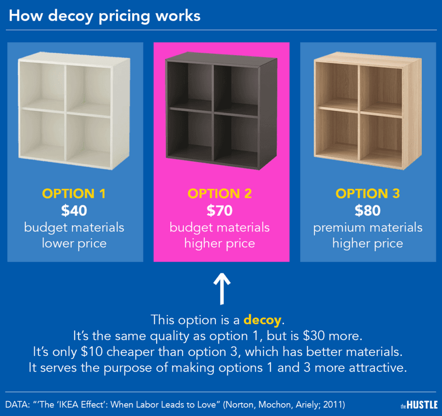
Something else you’ll likely see at play in Ikea is decoy pricing: when a retailer throws a less appealing option into the mix to make other products seem like a better deal.
Let’s say there are 2 cabinets for sale: a $40 budget unit, and an $80 unit with more premium materials. Ikea might create a 3rd unit — one that offers neither the low price of the budget unit, nor the premium materials of the pricier unit — to make the others look better.
Studies have shown that the decoy effect can increase retail sales by as much as 14%.
30
163 reads
Affordable Prices
Ikea often follows a “price first, design later” philosophy: It starts with a price target — say $6.99 for a new stool — then reverse-engineers the design process to meet that goal.
And once an Ikea product hits the shelves, the company is militant about maintaining or even reducing, its retail price.
Researchers at Boston University and the Wharton School studied hundreds of Ikea catalogues in 6 different countries between 1994 and 2010 and found that many of the company’s products get cheaper over time.
26
142 reads
How Prices At Ikea Stay Affordable
The main ingredient of the company’s affordability is a technique called flat packing.
The company reduces manufacturing, logistics, and fulfilment costs by disassembling items and fitting pieces together in a box as tightly as possible.
“We hate air” is a common mantra at Ikea: Every pocket of space is accounted for and minimized.
Ikea designs products with manufacturing and transit in mind from the get-go. They design products for the realities of the supply chain, rather than having to make sacrifices for it.
27
124 reads
The Ikea effect
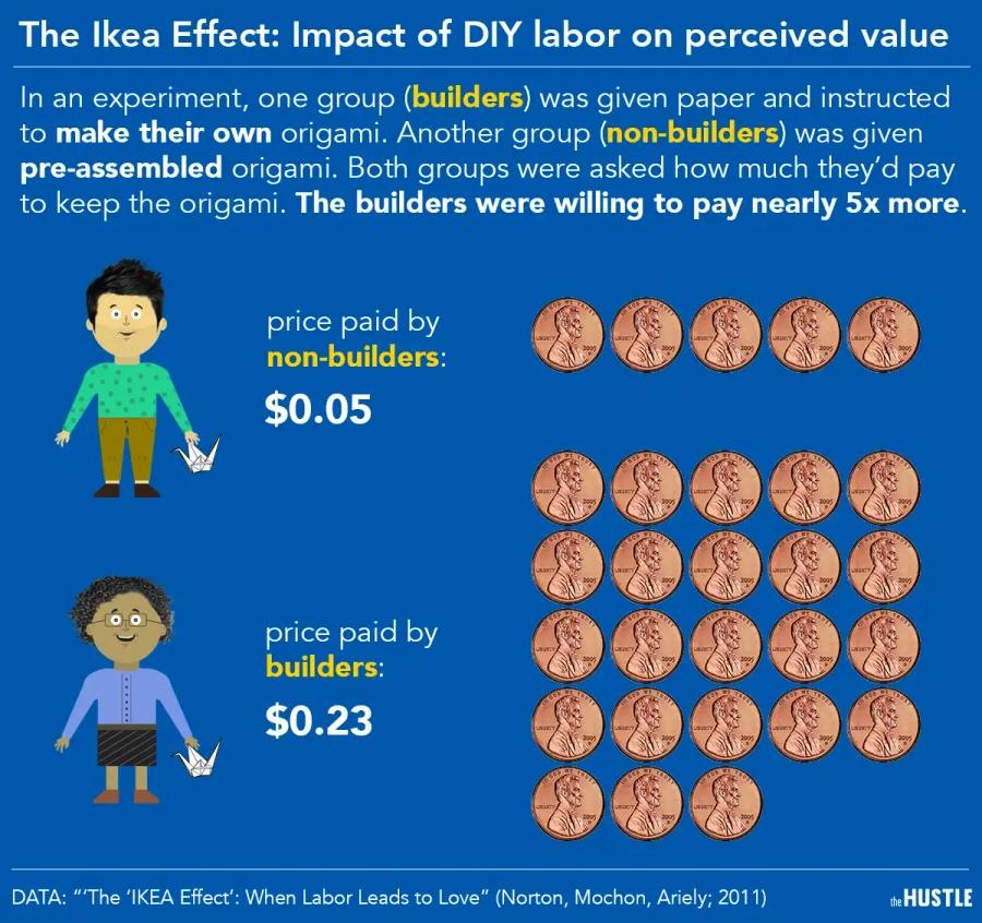
In a 2011 Harvard Business School study, researchers divided subjects into 2 groups: One was given pre-assembled origami, and the other was given paper to build their own origami. At the end of the experiment, subjects were asked how much they’d pay for the creations.
The result: Those who built their own origami were willing to pay nearly 5x more than the non-builders.
The researchers dubbed this the Ikea effect: a cognitive bias wherein we place a higher value on items we build ourselves, regardless of the quality of the end result.
29
134 reads
The Cake Mix Story
In the 1950s, manufacturers noticed that powdered cake mix sales were suffering. All the consumer had to do was add water. But this process was too easy: It removed the effort and emotion from baking. When manufacturers took out the egg powder and made consumers add their own fresh eggs to the mix, sales went back up.
27
137 reads
Ikea The Food Court
Ikea may be a home furnishings store, but it also reels in ~$2.4B in food sales per year (~5% of its overall revenue).
To put that into perspective: If you were to look at Ikea’s food operation as a stand-alone entity, it would rank as one of the 50 highest-grossing food chains in the world, right above IHOP.
A typical Ikea has 2 dining options that can accommodate 600+ diners at a time:
- A Swedish food market on the main floor that serves up meatballs, gravlax salmon, and other Scandinavian entrees.
- A bistro near the exit that slings hot dogs, cinnamon buns, pizza, and other fast-serve favourites.
26
128 reads
Selling Cheap Food
The real objective of selling cheap food at the furniture store is to reinforce Ikea’s low price profile.
A person might not know if $500 is a good price for a couch, but they surely know that $0.99 is a fantastic deal for breakfast. The idea is that customers will associate Ikea’s low food prices with the store’s other offerings.
Ikea might be selling some of that food at cost, or even at a loss. But it’s worth it to lose money on scrambled eggs if it means helping them sell more couches.
26
119 reads
IDEAS CURATED BY
Allison Cole's ideas are part of this journey:
Learn more about business with this collection
Effective communication
Persuasion techniques
Closing a sale
Related collections
Similar ideas
4 ideas
A brief history of IKEA: From cheap bookcases to Swedish meatballs
businessofbusiness.com
4 ideas
How IKEA Evolved Its Strategy While Keeping Its Culture Constant
vertexviews.wordpress.com
5 ideas
How to Translate Foot Traffic Into Digital Sales
neilpatel.com
Read & Learn
20x Faster
without
deepstash
with
deepstash
with
deepstash
Personalized microlearning
—
100+ Learning Journeys
—
Access to 200,000+ ideas
—
Access to the mobile app
—
Unlimited idea saving
—
—
Unlimited history
—
—
Unlimited listening to ideas
—
—
Downloading & offline access
—
—
Supercharge your mind with one idea per day
Enter your email and spend 1 minute every day to learn something new.
I agree to receive email updates

