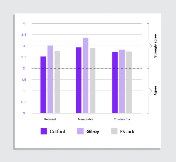
Study on fonts and emotional responses
A recent study tested the stimuli of 400 participants in three contrasting typefaces:
FS Jack, a soft, lightweight sans serif
Gilroy, a bolder, more geometric sans serif
Cotford, a serif font that looks more historical
When participants were shown the word “quality” in Cotford, they found it 10% more noteworthy than the two other fonts. When they were shown a full sentence in Gilroy, they found it stood out by 12%. These numbers may seem marginal. However, any difference above 5 to 6% is considered significant.
10
71 reads
CURATED FROM
IDEAS CURATED BY
The idea is part of this collection:
Learn more about psychology with this collection
The power of gratitude and positive thinking
Ways to improve your mood
Simple daily habits for a happier life
Related collections
Read & Learn
20x Faster
without
deepstash
with
deepstash
with
deepstash
Personalized microlearning
—
100+ Learning Journeys
—
Access to 200,000+ ideas
—
Access to the mobile app
—
Unlimited idea saving
—
—
Unlimited history
—
—
Unlimited listening to ideas
—
—
Downloading & offline access
—
—
Supercharge your mind with one idea per day
Enter your email and spend 1 minute every day to learn something new.
I agree to receive email updates
