Contrast
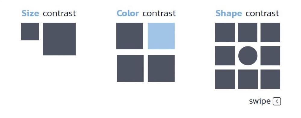
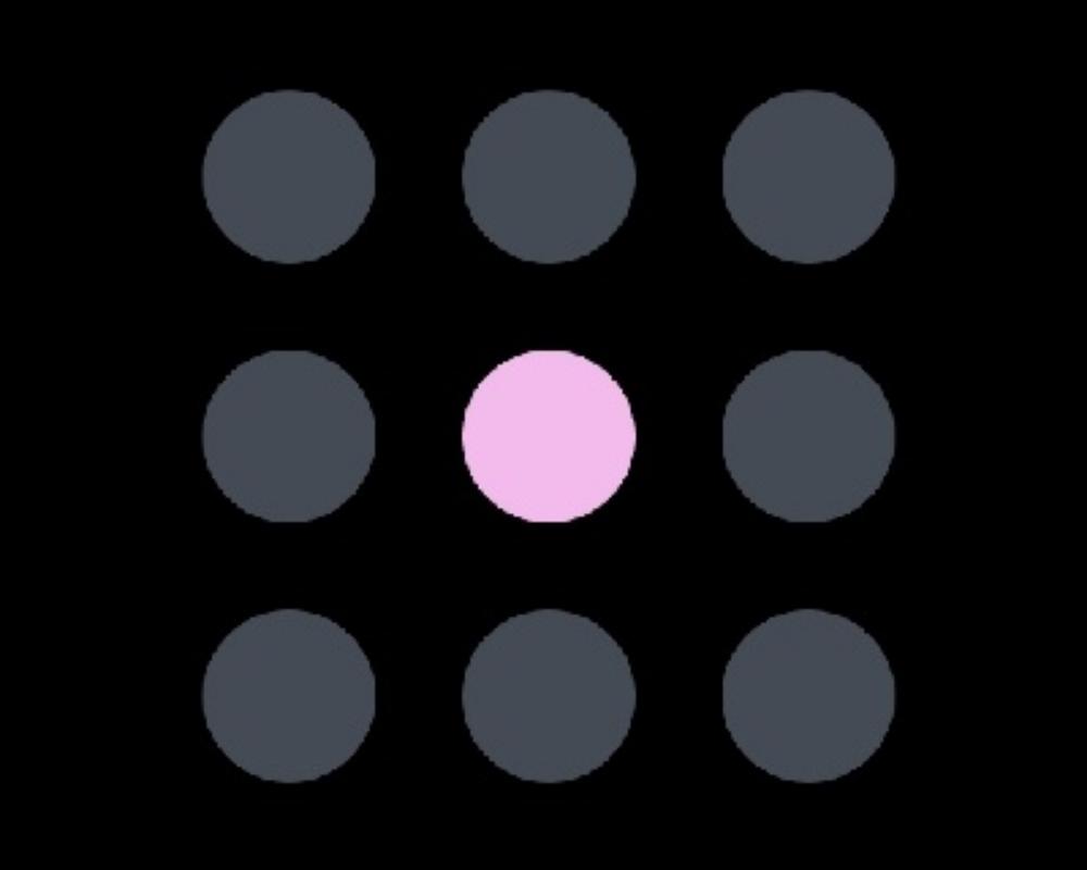
Contrast is created by including elements that arevisually distinct from one another in terms of color, size, font, shape, and so on.
1
9 reads
CURATED FROM
IDEAS CURATED BY
We watch business leaders fall in love with their brands by helping them learn, strategize, and execute better brand experiences.
As design gets more and more integrated into businesses it’s crucial that business leaders know how to speak the language. These ideas cover the basics of design language so you can start communicating better with your creative team!
“
The idea is part of this collection:
Learn more about marketingandsales with this collection
How to create a productive environment
The importance of self-care in productivity
How to avoid distractions
Related collections
Similar ideas to Contrast
1. Emphasis
Emphasis is the use of visual elements to create a focal point in a design. This can be done through the use of contrast, size, color, or placement.
6. Unity
Unity is the sense of a whole that is created when all of the elements of a design work together. This can be achieved through the use of repetition, rhythm, color, or shape.
Principles of art: Contrast
Contrast is when each element of art in a composition is made stronger in relation to the other. When next to each other, contrasting elements are among the first places that the viewer's eye is drawn.
Examples of contrast:
- Negative/positive ...
Read & Learn
20x Faster
without
deepstash
with
deepstash
with
deepstash
Personalized microlearning
—
100+ Learning Journeys
—
Access to 200,000+ ideas
—
Access to the mobile app
—
Unlimited idea saving
—
—
Unlimited history
—
—
Unlimited listening to ideas
—
—
Downloading & offline access
—
—
Supercharge your mind with one idea per day
Enter your email and spend 1 minute every day to learn something new.
I agree to receive email updates


