
The Landing Page
A landing page is a section of a website accessed by clicking a hyperlink on another web page, and much different from the website’s home page. The main difference is all in the focus of that page.
Your landing page should always be the first thing your customers see when they click on your URL. In short, landing pages are designed for conversion.
14
250 reads
CURATED FROM
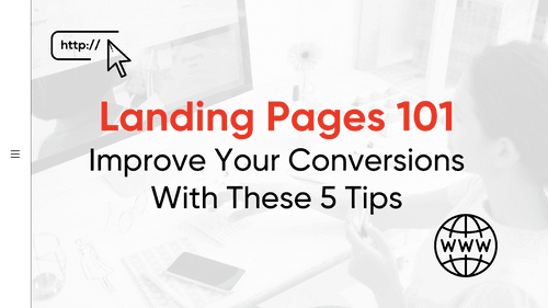
Landing Pages 101: Improve Your Conversions With These 5 Tips
business2community.com
11 ideas
·690 reads
IDEAS CURATED BY

All about landing pages, CTAs and optimizing the conversion rate.
“
The idea is part of this collection:
Learn more about marketingandsales with this collection
How to analyze churn data and make data-driven decisions
The importance of customer feedback
How to improve customer experience
Related collections


Similar ideas to The Landing Page
The “What Is” Pillar Page
To tap into this desire to learn more, a pillar page can serve as a definitive examination of a subject — a highly useful stand-alone resource that links to related cluster pages and develops aspects of the subject in greater detail. In many ways, it is authoritative, like a guide page.
If ...
The "Guide" Pillar Page
A “guide” pillar page strives to be the ultimate authority on a subject. It serves to establish your authority in a field or subject matter, builds your brand, & helps establish trust with a particular audience.
The guide pillar page gives a comprehensive overview of a topic that makes it a...
7. Turn your homepage into a lead collection magnet
The homepage usually has the most traffic out of all pages on s site. It makes sense—after all, your homepage is linked to from every other page. It’s also the “face” of your website. A certain percentage of people who entered from another page will likely click through to your homepage and check...
Read & Learn
20x Faster
without
deepstash
with
deepstash
with
deepstash
Personalized microlearning
—
100+ Learning Journeys
—
Access to 200,000+ ideas
—
Access to the mobile app
—
Unlimited idea saving
—
—
Unlimited history
—
—
Unlimited listening to ideas
—
—
Downloading & offline access
—
—
Supercharge your mind with one idea per day
Enter your email and spend 1 minute every day to learn something new.
I agree to receive email updates