White-Space
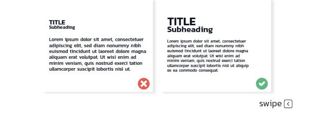
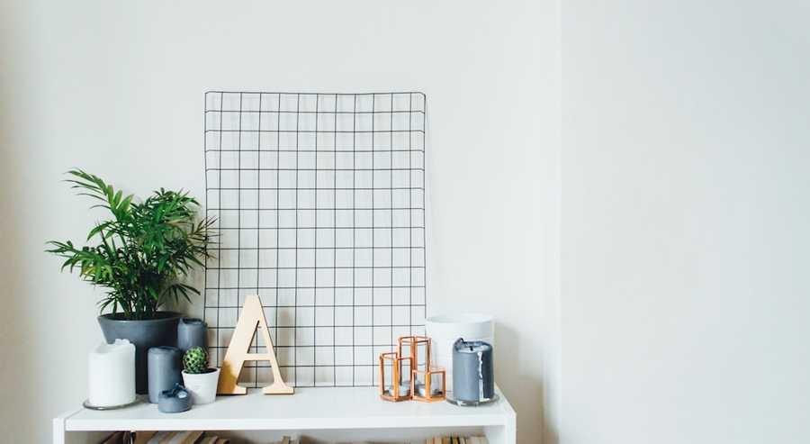
White-space or negative-space is the distance orspace that doesn't contain any, images graphics, or text. It can help layouts breathe and make things look less cluttered.
1
0 reads
CURATED FROM
IDEAS CURATED BY
We watch business leaders fall in love with their brands by helping them learn, strategize, and execute better brand experiences.
As design gets more and more integrated into businesses it’s crucial that business leaders know how to speak the language. These ideas cover the basics of design language so you can start communicating better with your creative team!
“
The idea is part of this collection:
Learn more about marketingandsales with this collection
How to create a productive environment
The importance of self-care in productivity
How to avoid distractions
Related collections
Similar ideas to White-Space
How Powerful White Space Can Affect Our Daily Routine
In design, “white space” is negative space. It’s not blank space because it has a purpose. It is balancing the rest of the design by throwing what is on the page (or the screen) into relief. The white space helps focus our visual attention.
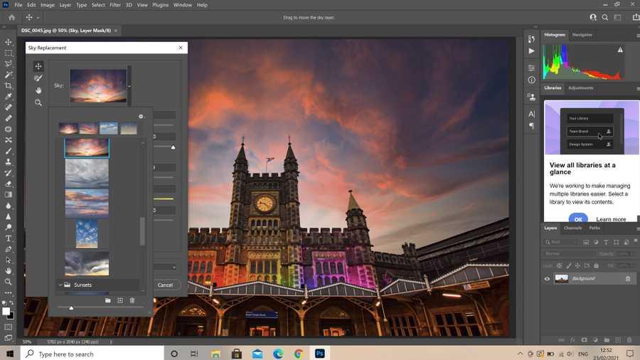
Adobe Photoshop
Photoshop is the world’s most popular photo editing app.
- As a designer, you’ll be using Photoshop for editing and modifying raster/bitmap graphics (aka JPEGs, PNGS, and GIFs) for use in your designs—in simpler terms, it uses pixels to make images.
- The progr...
White Space: Room Of One's Own
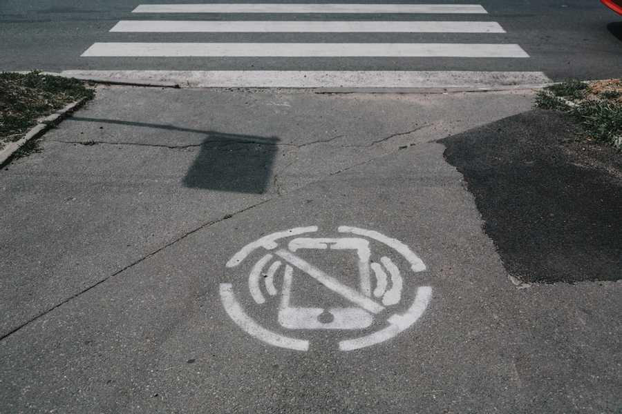
Think about how we can open up our schedule and let some white space in — the mental equivalent of a light, airy room of one’s own that we allow ourselves to retreat to, and refuel, a few times a day.
It should be noted that a “room of one’s own” means that. We are ...
Read & Learn
20x Faster
without
deepstash
with
deepstash
with
deepstash
Personalized microlearning
—
100+ Learning Journeys
—
Access to 200,000+ ideas
—
Access to the mobile app
—
Unlimited idea saving
—
—
Unlimited history
—
—
Unlimited listening to ideas
—
—
Downloading & offline access
—
—
Supercharge your mind with one idea per day
Enter your email and spend 1 minute every day to learn something new.
I agree to receive email updates


