
How Brands Use The Psychology Of Color To Manipulate You
Curated from: businessinsider.com
Ideas, facts & insights covering these topics:
7 ideas
·1.85K reads
42
2
Explore the World's Best Ideas
Join today and uncover 100+ curated journeys from 50+ topics. Unlock access to our mobile app with extensive features.
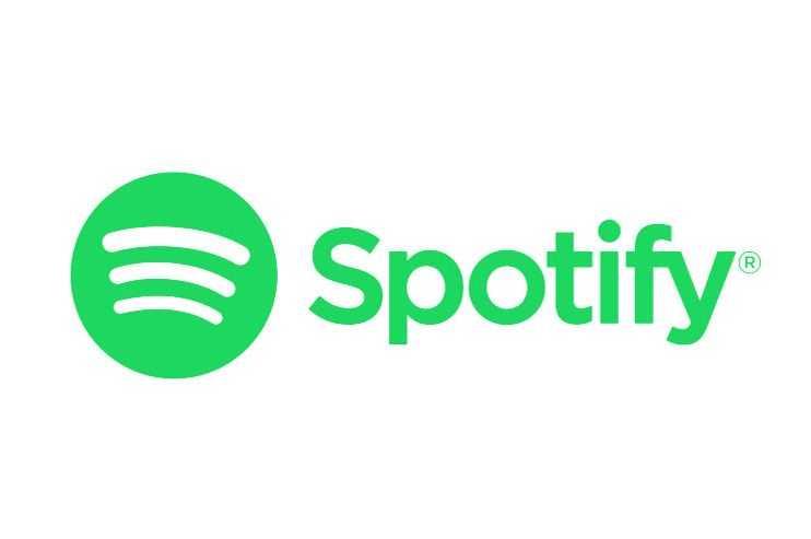
Green - youthfulness and love of Mother Earth
What it means: Green is the color of money and envy, but it also signifies the environment, Mother Earth, and universal love. Green is attractive to youth and to those who enjoy life.
Which brands use it: The green mermaid on the center of every Starbucks cup is intended to brand the coffee company as one that is young and Earth-friendly. Starbucks is proud of its responsibility to the environment and its fair trade coffee products. Garnier Fructis is another green-colored brand, whose shampoos and other hair and body products jump off the shelves.
65
378 reads
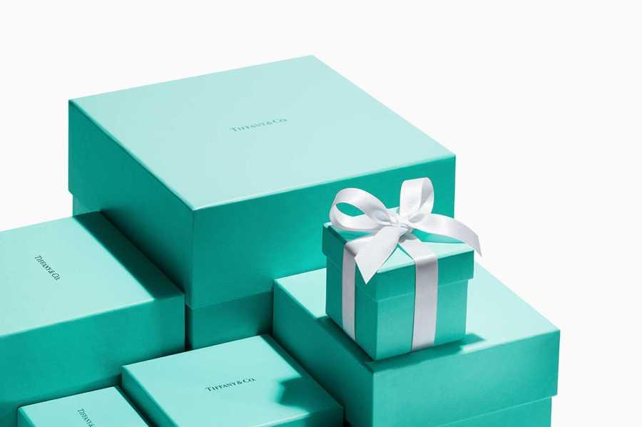
Blue - calm and logical
What it means: Blue represents “trust, integrity, and communication”. However, the use of the wrong tone of blue “can make a brand appear cold, aloof and unapproachable.” Blue relates to the mind, so consumers associate it with logic and communication. It’s also serene, like the ocean, and calming to look at.
Which brands use it: The major social media companies —Facebook, Twitter, LinkedIn—use blue as their primary brand colors.
Tiffany & Co. is also immediately recognized by its trademark teal blue.
63
295 reads
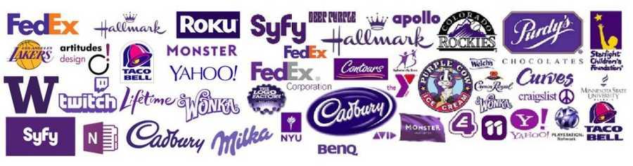
Purple - luxurious and whimsical
What it means: “Quality, luxury, and decadence” are all associated with purple , as is royalty. However, it can sometimes come off as tacky, too whimsical, or not in touch with reality, and depending on the company, this can be detrimental to the message the brand wants to send.
Which brands use it: Cadbury’s trademark purple pairs well with its rich chocolate products. Pop singer Prince is also known for being decked out in purple.
61
271 reads
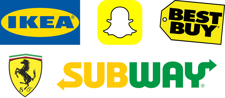
Yellow - fun and friendly
What it means: Brands that use yellow are “expressing a personality of happiness, optimism and friendliness.” Yellow is also the most visible color in daylight, making it difficult to overlook brands that use the color.
Which brands use it: McDonald’s uses yellow in the big yellow ‘M’ raised high above the streets. Contrasted against a blue sky, it pops out at people driving by. IKEA also uses yellow in order to tell consumers that shopping at IKEA is a fun, happy experience.
64
243 reads
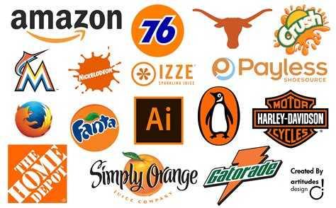
Orange - playfulness and physical comfort
What it means: Orange is powerfully bright. Companies using orange are seen as “fun, playful and enjoying social interaction.” Orange can also represent physical comfort, like food and warmth. But be cautious when using orange, she says, because some brands that do “come across as frivolous” and unable to take things seriously.
Which brands use it: The kids’ TV network Nickelodeon is branded with a bright orange splat. It’s a good choice for the brand because it stands out to kids, and the programming they present is all about having fun.
62
206 reads
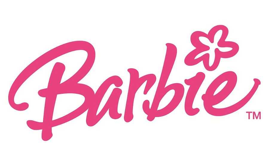
Pink - sweet
What it means: Pink may be an obvious color to associate with certain qualities. Pink stands for femininity, as well as “love, nurturing, and caring.” A lighter pink is sweet, usually marketed towards little girls, whereas a brighter pink holds sex appeal.
Which brands use it: Victoria’s secret is a prime example of a pink-branded company. They even have a line of products called PINK. Many charities related to breast cancer, such as Susan G. Komen, color themselves pink, along with the recognizable awareness ribbons worn during Breast Cancer Awareness month.
61
207 reads
Brown - warmth and dependability
What it means: Chocolate is something that first comes to mind when you think of brown, but the deeper meaning behind the color is warmth, safety, reliability, and dependability.
Which brands use it: UPS is a brand consumers want to trust to get their mail and packages from point A to point B on time. Brown is a great color choice for them. On the chocolate side of things, original M&Ms come in the easily identifiable brown packaging, and all the warm feelings of the sweet chocolate are there in the brand.
62
254 reads
IDEAS CURATED BY

Maria-Diana Dutica's ideas are part of this journey:

Learn more about personaldevelopment with this collection
The importance of innovation
The power of perseverance
How to think big and take risks
Related collections


Similar ideas

7 ideas
Can a corporation "own" a color?
thehustle.co

14 ideas
Color Psychology: How Colors Affect Us and What Each One Means
blog.cognifit.com

2 ideas
Color Psychology: How Colors Influence the Mind
psychologytoday.com
Read & Learn
20x Faster
without
deepstash
with
deepstash
with
deepstash
Personalized microlearning
—
100+ Learning Journeys
—
Access to 200,000+ ideas
—
Access to the mobile app
—
Unlimited idea saving
—
—
Unlimited history
—
—
Unlimited listening to ideas
—
—
Downloading & offline access
—
—
Supercharge your mind with one idea per day
Enter your email and spend 1 minute every day to learn something new.
I agree to receive email updates