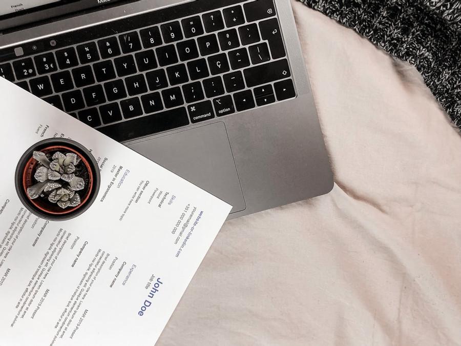
How to Design Your Résumé: 15 Formatting and Layout Tips
Curated from: careeraddict.com
Ideas, facts & insights covering these topics:
5 ideas
·1.29K reads
7
Explore the World's Best Ideas
Join today and uncover 100+ curated journeys from 50+ topics. Unlock access to our mobile app with extensive features.
Designing Your Resume
our skills, achievements and qualifications are what really matter on your résumé, but how you present that information is just as important.
42
420 reads
Keep It Simple
Colour
As a general rule of thumb, choose a high-contrast color scheme — and stick to it. A safe color scheme is black (for general text), white (for the background) and a third color like red, green or blue (for headings).
Layout
This keeps text away from the edge of the page, which aids in the overall readability of your résumé. Increase or decrease the margin based on the content
Font
choose professional font - Calibri, Helvetica, Avenir, Georgia or Garamond.
50
165 reads
Content Hierarchy
- Create an eye-catching header
- Divide content into clear sections
- Set headings for each section
- Use bullet points
- Use digits for numbers
- organize with columns and tables
47
249 reads
Essential Sections
Your résumé must always include these five essential sections:
Header
Summary or objective
Employment history
Education
Skills
48
221 reads
Mind The
Try to keep your résumé to a maximum of two pages. If you’re just out of college and don’t have much work experience, meanwhile, one page will usually be more than enough.
44
240 reads
IDEAS CURATED BY
CURATOR'S NOTE
Designing your resume
“
sampath kumar Arunachalam's ideas are part of this journey:
Learn more about writing with this collection
Understanding the importance of constructive criticism
How to receive constructive criticism positively
How to use constructive criticism to improve performance
Related collections
Similar ideas
Read & Learn
20x Faster
without
deepstash
with
deepstash
with
deepstash
Personalized microlearning
—
100+ Learning Journeys
—
Access to 200,000+ ideas
—
Access to the mobile app
—
Unlimited idea saving
—
—
Unlimited history
—
—
Unlimited listening to ideas
—
—
Downloading & offline access
—
—
Supercharge your mind with one idea per day
Enter your email and spend 1 minute every day to learn something new.
I agree to receive email updates


