Explore the World's Best Ideas
Join today and uncover 100+ curated journeys from 50+ topics. Unlock access to our mobile app with extensive features.
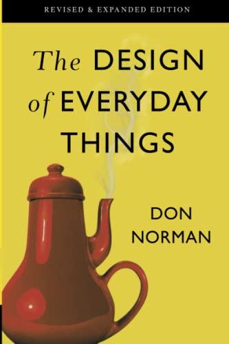
The designer of everyday things must take into account the whole experience of the person using the product or service, not just the product itself.
DON
11
38 reads
Make Things Visible
Good design should make it clear what actions are possible and what the current state of the system is.
11
28 reads
Provide Feedback
Users should be informed of the results of their actions and the system's current state.
10
23 reads
Make Use Of Constraints
Making use of constraints guides the user in the roght direction
example:
ATM may be designed to only allow the user to make a withdrawal after they have inserted their bank card and entered their PIN (Personal Identification Number). This constraint guides the user towards the correct action (inserting their card and entering their PIN) and prevents errors such as trying to make a withdrawal without first inserting their card.
10
23 reads
Simplify The Structure Of Tasks
Break down complex tasks into smaller, more manageable sub-tasks.
example:
contact form in a website, by breaking down the task into smaller sub-tasks such as filling out personal information, the subject, and the message, the user doesn't feel overwhelmed and can complete the task easily.
11
21 reads
Make Things Physically Easy To Use
Good design should take into account the physical abilities and limitations of users.
11
22 reads
Provide Good Defaults
Provide a good starting point for users and make it easy to return to a known state.
example:
"The Nothing Phone 1 was so similar to the Apple iPhone that it immediately had a positive influence in the smartphone market."
10
23 reads
Provide Flexibility And Versatility
Allow users to adapt the system to their needs and preferences
example:
A thermostat with a digital interface, where the temperature, fan speed, schedule and other options are easy to find and adjust.
10
20 reads
Get The Mapping Right
The relationship between controls and their effects should be intuitive and consistent.
example: pro
The controls on a toaster typically include a lever to lower the bread into the toaster, a dial or buttons to set the desired level of toasting, and a button or lever to eject the toast when it is done. The relationship between these controls and their effects is intuitive and consistent, meaning that it is easy for the user to understand how to operate the toaster.
11
16 reads
Make Things Aesthetically Pleasing
An aesthetic design draws the users attention and almost fades away in the distance unless noticed.
11
24 reads
IDEAS CURATED BY
A lifelong learner with a passion for continual self-improvement and growth, always seeking new knowledge and experiences to broaden their perspective and understanding of the world.
CURATOR'S NOTE
This book was a classic and took me about a month to complete haha
“
Curious about different takes? Check out our The Design of Everyday Things Summary book page to explore multiple unique summaries written by Deepstash users.
Syed Daniyal's ideas are part of this journey:
Learn more about books with this collection
How to strengthen your willpower
How to overcome temptation and distractions
The role of motivation in willpower
Related collections
Different Perspectives Curated by Others from The Design of Everyday Things
Curious about different takes? Check out our book page to explore multiple unique summaries written by Deepstash curators:
3 ideas
3 ideas
5 ideas
Discover Key Ideas from Books on Similar Topics
5 ideas
How To Improve Your Drawing With Negative Space
informationprime.wordpress.com
4 ideas
Do you worry too much? Stoicism can help
bigthink.com
5 ideas
Small Teaching
James M. Lang
Read & Learn
20x Faster
without
deepstash
with
deepstash
with
deepstash
Personalized microlearning
—
100+ Learning Journeys
—
Access to 200,000+ ideas
—
Access to the mobile app
—
Unlimited idea saving
—
—
Unlimited history
—
—
Unlimited listening to ideas
—
—
Downloading & offline access
—
—
Supercharge your mind with one idea per day
Enter your email and spend 1 minute every day to learn something new.
I agree to receive email updates


